Saturday, 31 March 2018

Stop Making These Common Mistakes with Your Website Popups (Includes Examples and Quick Fixes)

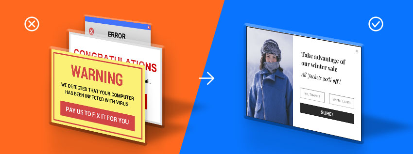
Depending on who you talk to, website popups are either a godsend for list building and subsequent revenue creation, or they’re a nuclear bomb for the user experience.

Some can’t stand popups and completely disregard sites that use them (or that’s what they say, at least). And there are even entire websites dedicated to hating on especially bad popups.

However, many marketers are fully charmed to their capabilities for revenue generation, lead collection, and driving attention and conversions in general.

It doesn’t have to be an either/or situation, though.

You can create website popups that aren’t detrimental to the user experience; In fact, if you do it really well, you can even improve the user experience with the right offer and presentation.

We all want to be companies that care a lot about our visitors and make the best popups possible, so it goes without saying, we care about timing, targeting, and triggering (i.e. who we send offers to, when we send them, and what those offers are). After all, the main reasons visitors get annoyed by popups are 1) when they disrupt the user experience and 2) when they offer no value or help:
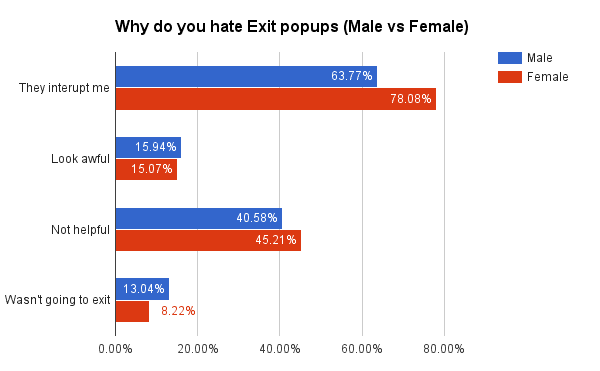
Fortunately, you can easily solve for these things. In this article I’ll outline common website popup mistakes with real examples, and I’ll cover a few ways to remedy these mistakes.

Mistake 1: Poor timing

One of the biggest mistakes marketers make with website popups is with timing. It’s almost always the case that we trigger popups too soon (i.e. right away, no matter the context of the page or visitor).

On an Inbound.org discussion, Dustin J. Verburg had this to say:

“The most hilarious popups are the ones that say ‘LOVE THIS CONTENT? SUBSCRIBE FOR MORE’ because they assault my eyes before I even read two words of the article.

Now I guess I’ll never know if I love the content, because I close the tab immediately and never come back.”

Similar to Dustin, imagine you’re taking break from work to check out GrowthHackers. You find an article on the front page that looks interesting. You open it and immediately get this:
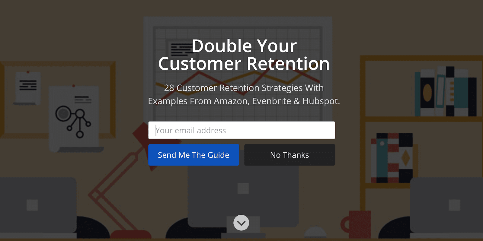
Woah, what’s this full screen takeover? I know this is common today, but most people are jarred by this experience.

Now you may not even remember what the article was, so you’re likely to click away and go back to actual work.

One possible way to remedy this – just spitballing here – could be to add some copy explaining that the visitor needs to click to continue on to the article. Forbes does this (though Forbes could never claim a good user experience without a good laugh):
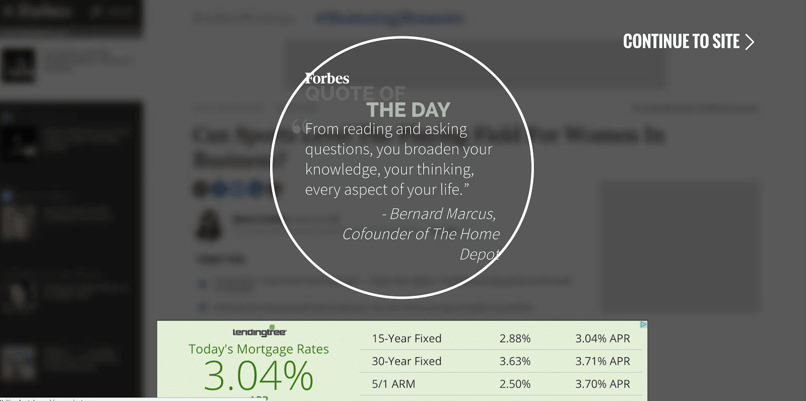
At least you know where you’re at (the logo is prominent) and what to do (continue to site). But, it goes without saying, Forbes’ experience is not ideal so don’t copy it.

So how do you fix poor timing?

The best possible solution for user experience is to trigger a popup at a time that actually benefits a visitor. On a long-form blog article, this is usually at some point of strong user engagement, either measured by time on site or, better, by scroll-depth and content engagement.

You can do this with an on-scroll popup created in Unbounce.

Once you’re happy with your design, simply set your trigger for when someone scrolls through a certain percentage of the page, or even after a delay you specify:
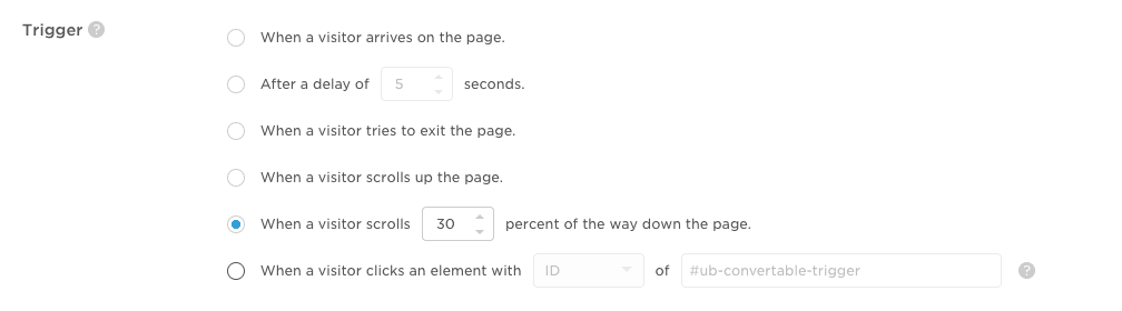
Click above for a larger, clearer image.

Overall, poor timing is a common problem, and it’s almost never intentional. We simply act hastily when setting up popups, or we spend all of our time crafting the offer and forget that when the offer is shown matters too.

I want to point out, however, that it’s not always a bad decision to throw a popup at visitors on arrival. It’s all about context.

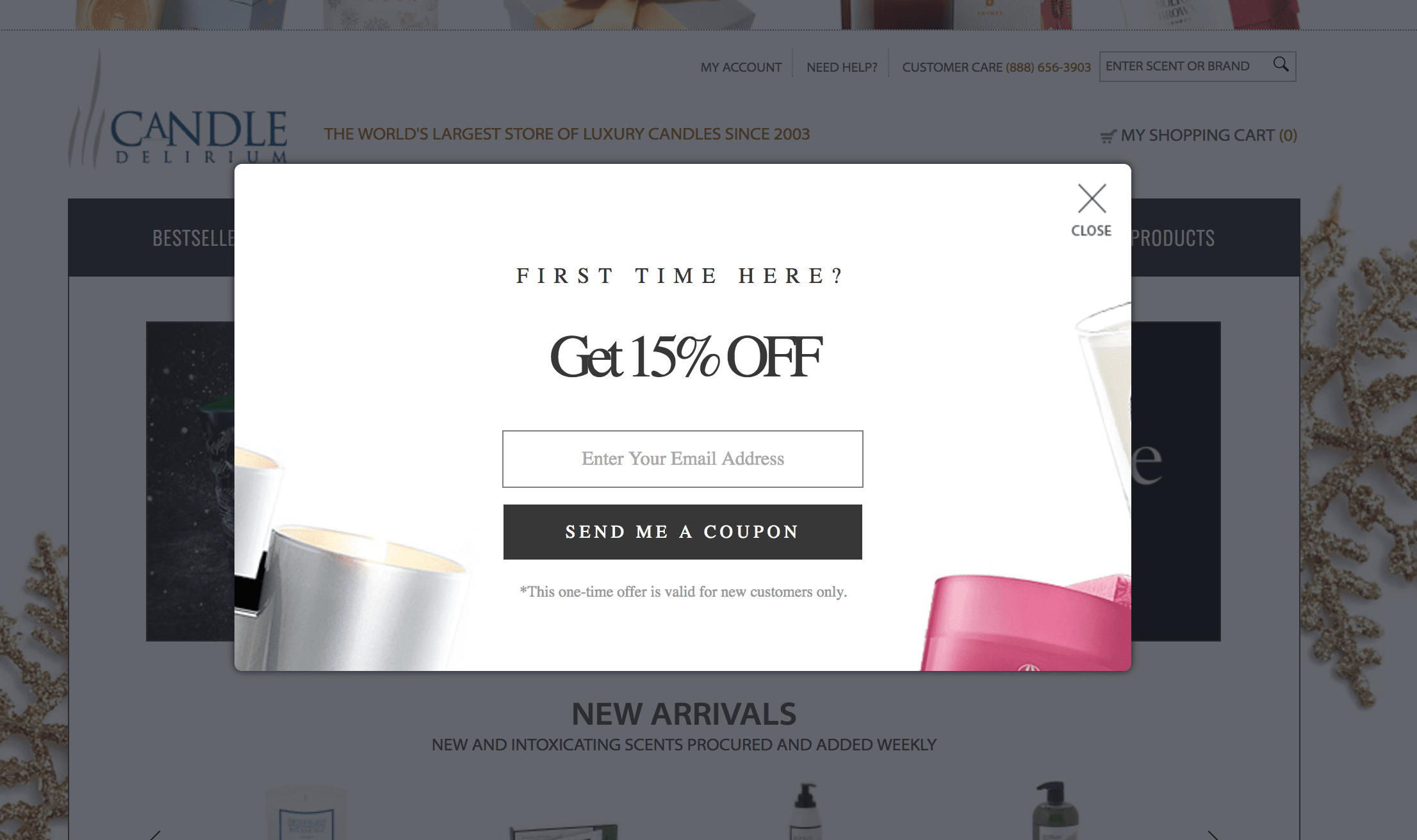
For example, if you’re shopping for clothes, there are a million options available. Therefore, it’s imperative for ecommerce shops to grab your attention as quickly as possible with an attractive offer. This is why you see so many website popups with discounts on arrival on ecommerce sites, like this one from Candle Delirium:
As well as this one from BustedTees:
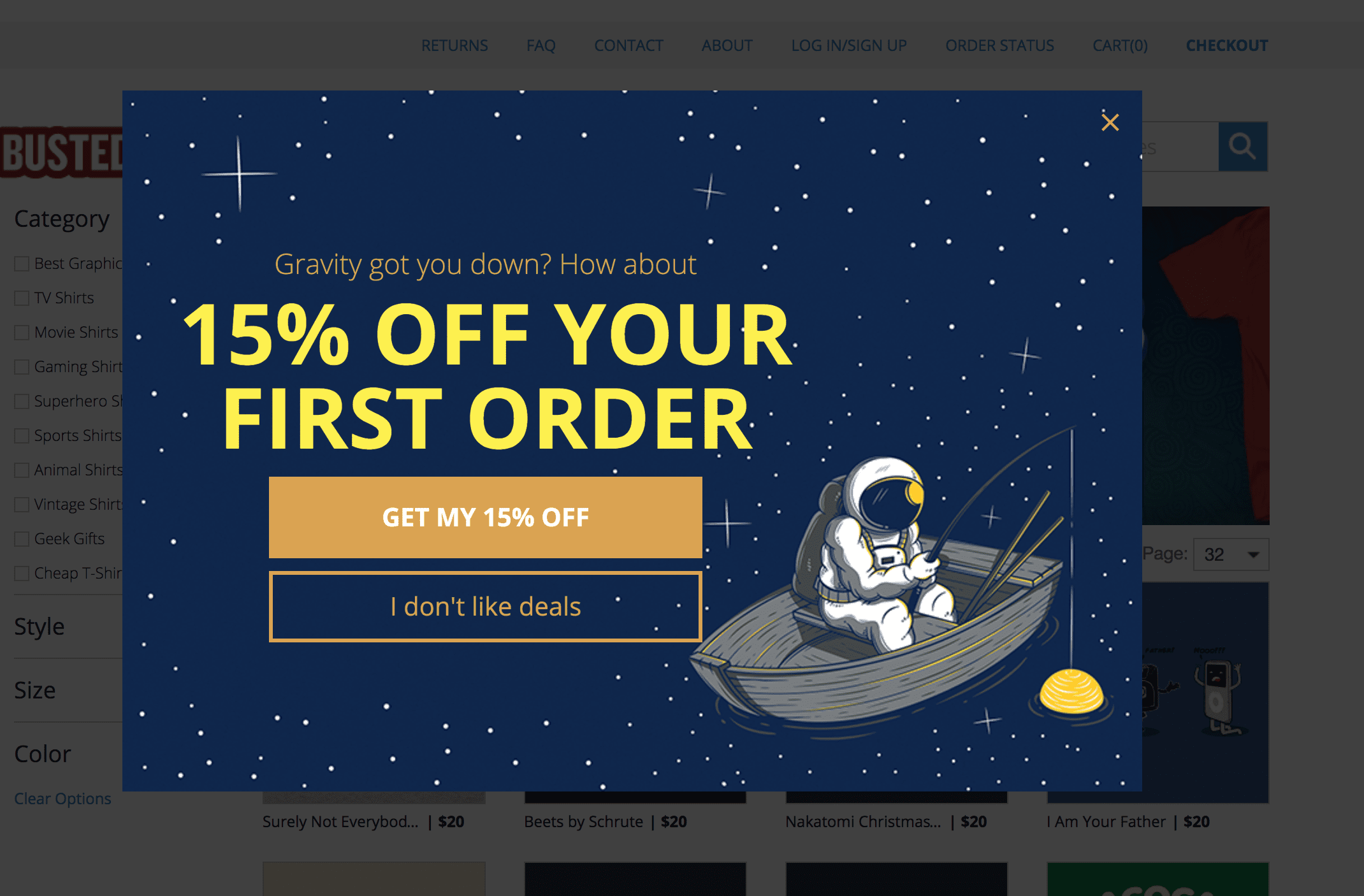
It’s a very common tactic. We’ll go over it specifically in regard to ecommerce later in section three.

In general, it’s important to analyze a visitor’s behavior and trigger the popup at the exact moment (or as close to it as possible) that someone would want to subscribe/download your offer/etc. It’s a lot of work to tease out when this may be, but the analysis is worth it as you’ll annoy fewer visitors and convert more subscribers or leads.

Fix annoying timing: Consider the user experience. Does it warrant an on-arrival popup? If not, what’s the absolute ideal timing for a popup, based on user intent, behavior, and offer?

Mistake 2: Poor targeting

Poor targeting is a broad problem that’s usually made up of a mismatch between who you’re targeting and what offer you’re sending (though, you could also add in when you’re targeting them as a variable as well).

For instance, if you’re targeting a first time organic visitor to a blog post with a popup that announces a new product feature, you may spur some confusion. Rather, you should try to target based on appropriate user attributes, as well as within the context of where they are in the user journey. A better offer for a first time blog visitor might be an ebook or email course on a topic related to the blog post.

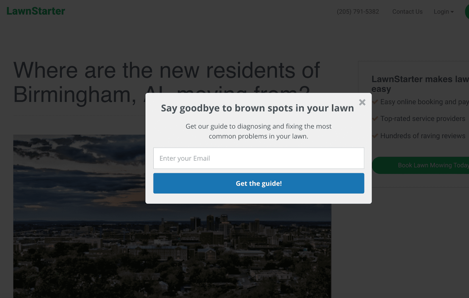
An example of poor targeting is LawnStarter’s guide on their post about where new residents of Birmingham are moving from. It’s a cool infographic-based guide they’re offering up, but the popup is really irrelevant to the content of the post someone’s currently reading in this case:
In another, better example, Mailshake has a massive guide on cold emailing, which would be a daunting read in a single session. It’s probably appropriate, then, that they offer the book up for download via a sticky bar at the bottom of a related article:
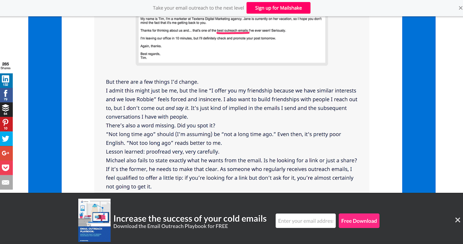
There are ways they could improve copy, design, or the offer itself, but the core point is that their targeting is spot on (i.e. after someone’s reading something about cold emailing, and offered up as added, downloadable value).

Now, if I already visited this page and downloaded the playbook, and they still hit me with this offer, then we’d have a targeting problem. They could use the fact that I’m a repeat visitor, as well as a subscriber already, to target me with a warmer offer, such as a deeper email course, a webinar, or possibly even a consultation/demo depending on their sales cycle and buyer’s journey.

The fix for poor targeting

Remember with targeting, you’re simply trying to align your offer with your visitor and where they are in their awareness and interest of your company and product.

This is where the value of progressive profiling comes in. But if you’re not doing that, at the very least you should be aligning the offers on your page with the intent of the traffic on that page.

You can also target offers based on URLs, location, referral source, and cookies. Really think about who is receiving your offer and at what point in the customer journey before you set a popup live.

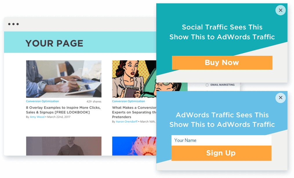
With popups created in Unbounce, for example, you can use referral source as a way to target appropriate offers to someone who’s come from social traffic, vs. someone who’s arrived via AdWords traffic:
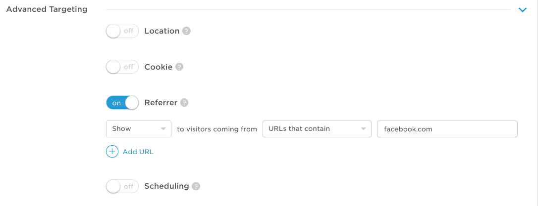
Simply create your popup, and in advanced targeting, select which referral sources you’d like to have access to the offer:
Fix targeting the wrong people at the wrong time with the wrong offer Analyze your customer journey and intent levels on content. Craft offers according to customer journey status as well as on-site user behavior.

Mistake 3: Offers with no obvious value

How many times have you been on a blog that simply wants you to sign up for a mailing list, no value promised or given? Like this:
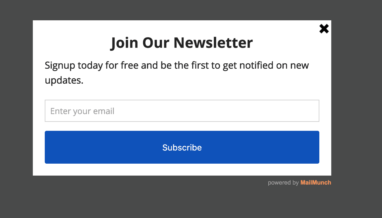
If you’re an active reader of the blog, maybe this works. After all, you already know the value of the content and simply want to sign up for updates. Makes sense. But I’d wager this type of active reader is a small percentage of traffic, and these people will sign up however they can. Thereby the popup isn’t useful for everyone else.

As we covered before, a much better way to capture attention is with a discount, like Allen Edmonds offers here as soon as I land on the site (on another note, this is a great use of an immediate triggering. It’s not an annoying popup when it delivers me a discount).
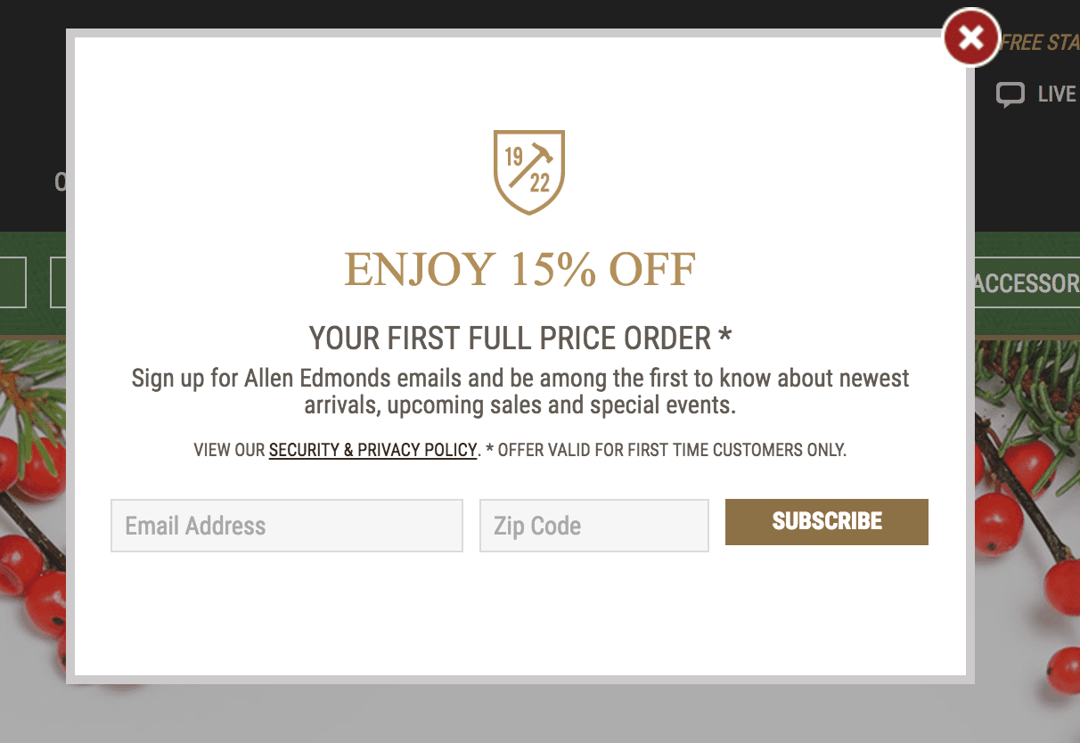
This is a super common ecommerce tactic.

It’s a competitive world out there, and giving an immediate hit in the form of a discount is a good way to capture some of that oh so valuable attention. It’s especially common when used on first time visitors to the homepage, as a homepage visitor’s experience is generally more variable and less intent-based (if they land on a product page from a search ad, it’s a bit of a different story).

Here’s an example from Levi’s:
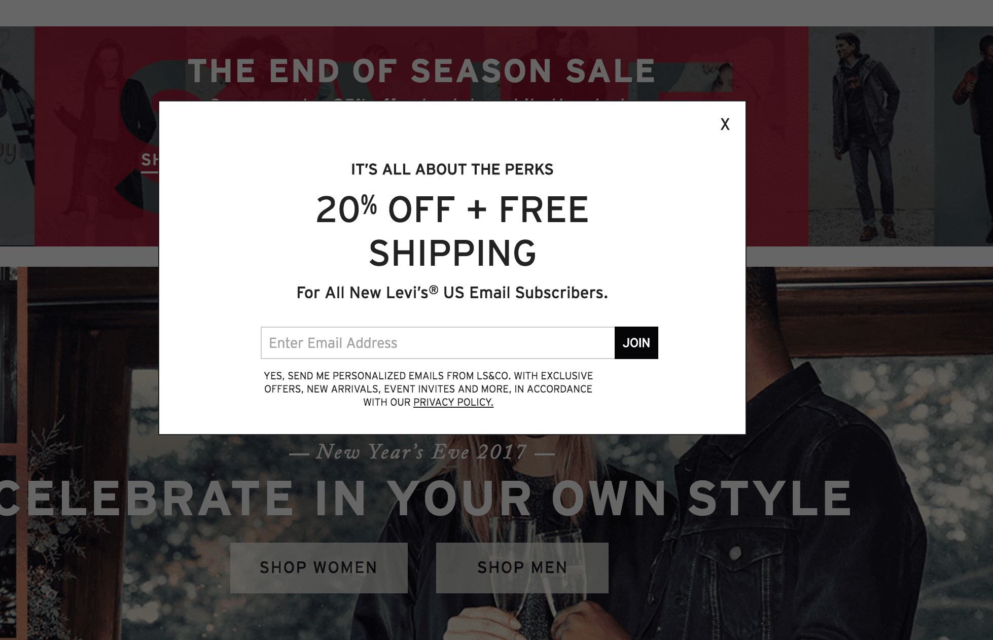
The fact that most ecommerce sites have similar messages nowadays is indicative of a creativity problem, one that presents itself to marketers in any industry. We look to competitors and to the consensus and think that we can’t fall behind, so we replicate tactics.

However, I’m more interested in sites, like Four Sigmatic, that push beyond and implement a creative offer, like their lottery style subscription featured below. (This is one of the only popups I’ve signed up for in months, by the way):
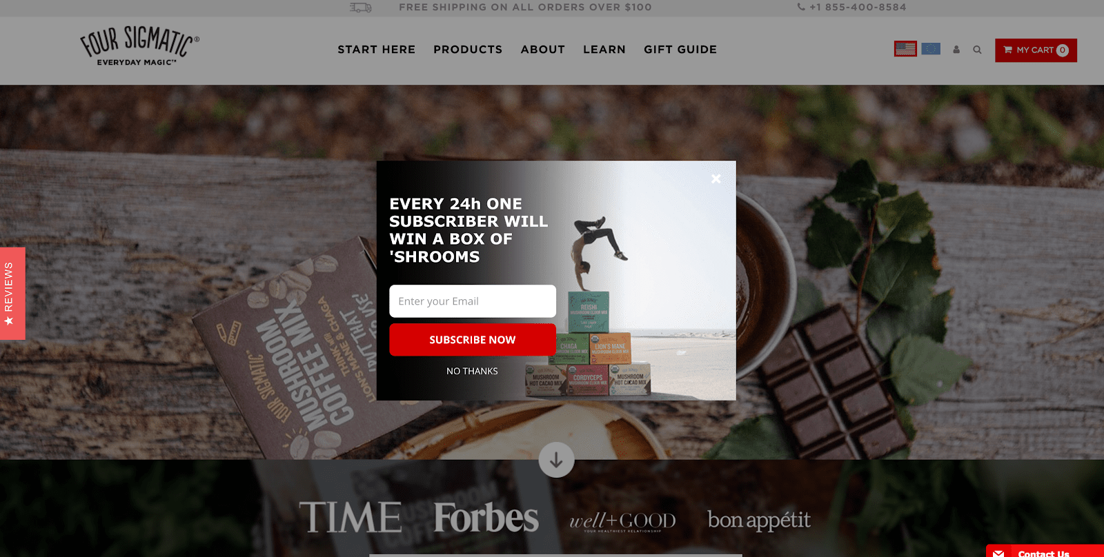
Offering up poor or no value is really the least forgivable mistake if you’re a marketer. Crafting offers that align to your buyer persona is your job. Also, it’s fun. If you have a bland offer, this could easily be the biggest opportunity for lifting conversions, as well as improving the user experience (no one is complaining about awesome offers).

Foot Cardigan does a really good job of offering value and conveying it in a fun way too:
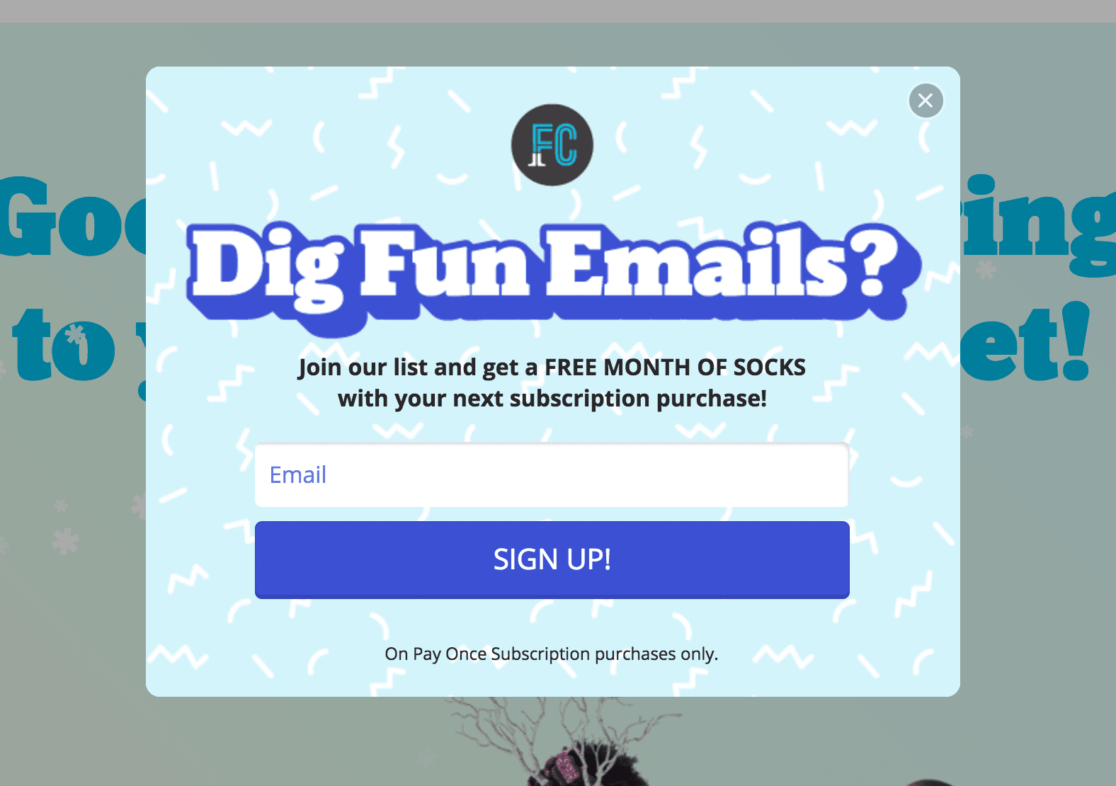
Triggering popups with zero value? Think about ways you can give massive value to your site visitors, so much that they really want to give you their email, and create an offer for this.

Mistake 4: Poor design

If you use Unbounce Popups, it’s almost hard to create an ugly one. Still though, the internet is filled with eye-sore examples:
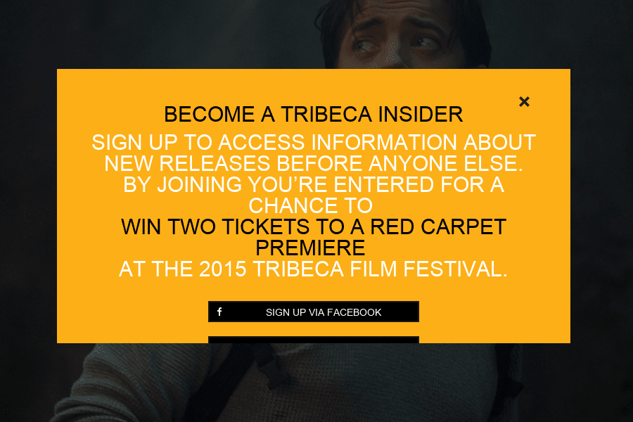
Design matters. A poorly designed website element can throw off your whole brand perception, which is important in creating trust, value, and in easing friction.

As Ott Niggulis put it in a ConversionXL article:

“Success in business online is all down to trust. You either see something that makes you trust a vendor or you don’t. Trust is also directly linked to conversions – if people leave your website because it’s so badly designed that it makes you seem untrustworthy then you’re missing out on lost prospects, customers, sales, and profits.

Good design = trust = more conversions = more money in your pocket. It’s as easy as that.”

That same article cites a study where 15 participants were directed to Google health information that was relevant to them, then they were asked about their first impressions of the sites.

Out of all the factors mentioned for distrusting a website, 94% were design related. Crazy!

So don’t just put up a poorly designed popup thinking the message will be the focus. Put some effort into it.

Of course, you don’t always need to look like a luxury brand. If cheap spartan is your schtick, then it can work for you. After all, Paul Graham’s site isn’t pretty but it’s so, so valuable:
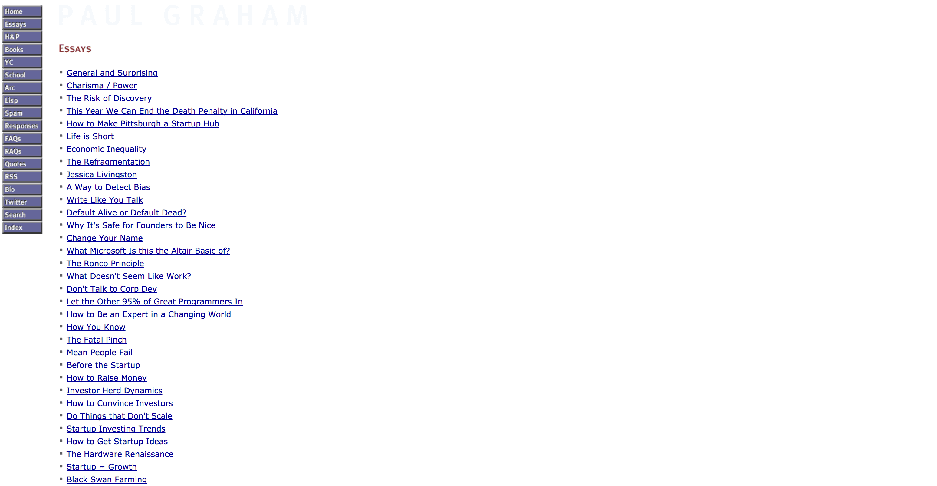
Image of Paul Graham’s site.

As Aurora Bedford from NN/g explains it, it’s more about matching design to your brand values and objectives:

“The most important thing to remember is that the initial perception of the site must actually match the business — not every website needs to strive to create a perception of luxury and sophistication, as what is valuable to one user may be at complete odds with another.”

No matter what your brand positioning may be, however, make sure you clean up obvious design mistakes before hitting publish.

Fix up bad design: Spend a few hours longer designing your popup, hire a designer, or use a tool like Unbounce with a template.

Mistake 5: Poor Copy

Presenting your offers with clear copy is huge. Most copywriting, not just on popups but online in general, is:

  • Boring
  • Vague
  • Confusing
  • Cringe-inducing

…in that order, I’d wager. Not often do you find crisp, clear, and compelling copy (unless it was whipped up by a professional, of course).

As with the example below, you’re more likely to find copy that’s vague (how many ebooks, which ones, etc.) and cringe-inducing (Rocking with a capital R is pretty goofy):
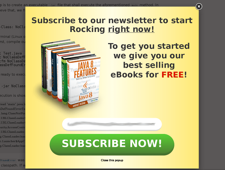
The copy you write for your popup may be the most effective mechanism you have for converting visitors (outside of the targeting rules). Here’s how Talia Wolf, founder of GetUplift, put it in an Inbound.org comment:

“Many people are trying to capture your customer’s attention too so you need to give them a good reason for subscribing/not leaving.

It’s not enough to talk about yourself, you need to address the customer’s needs: one way is by highlighting the value your customer gains. The other, highlighting what they might lose. (Example: “Join thousands of happy customers” vs. “Don’t lose this unique content we’re giving our subscribers only”

Her website has a solid example of a popup with great copywriting, by the way:
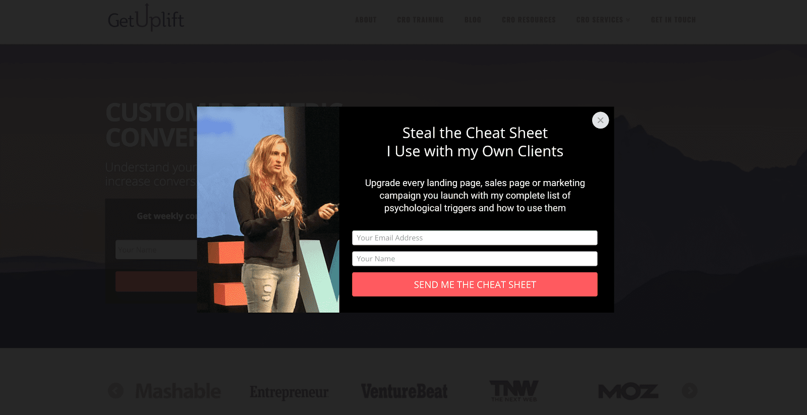
Sometimes, all you need to do is pull your message to the top and make it prominent. Often we try to write clever copy instead of clear copy, but clear always beats clever.

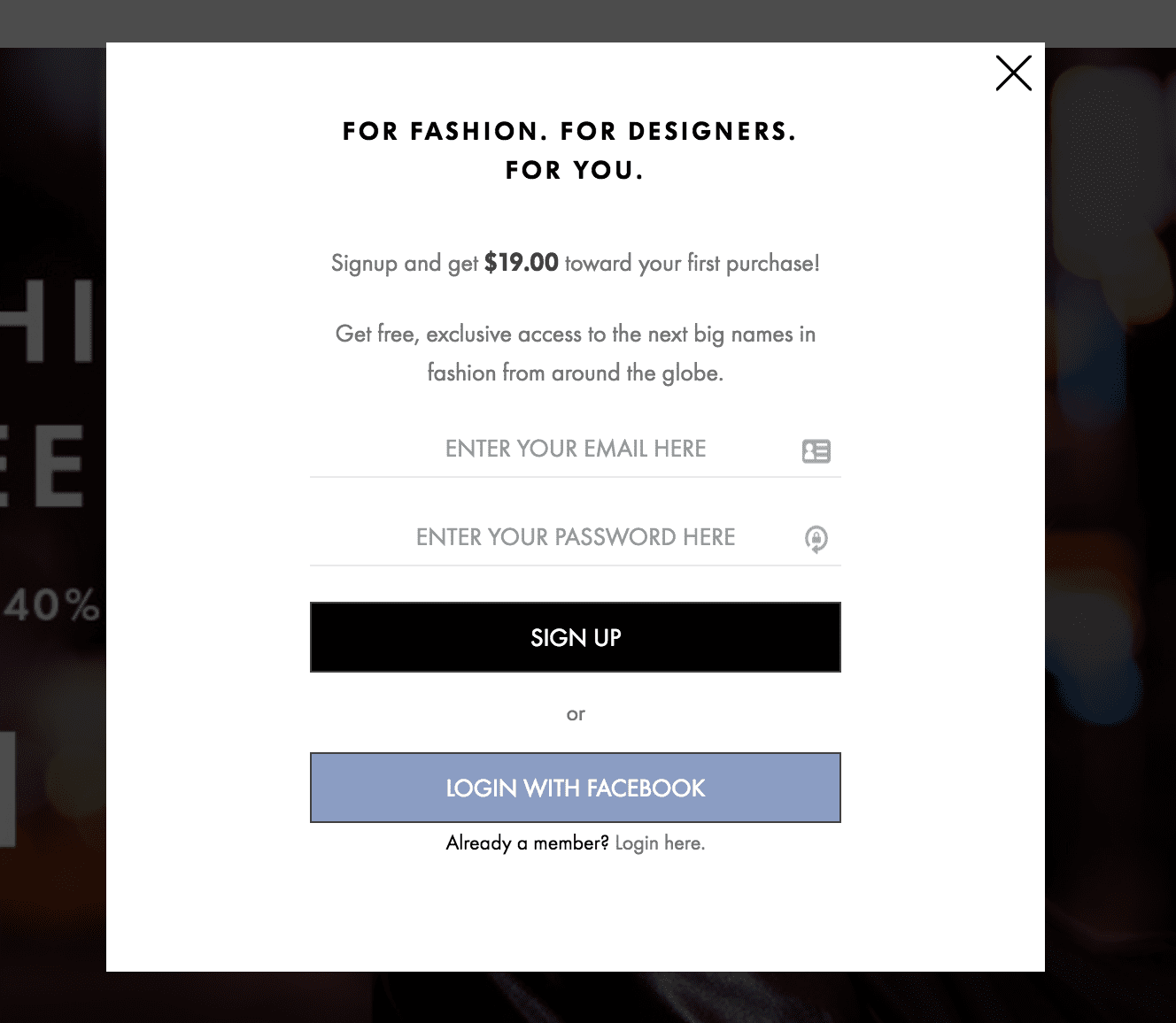
For example, if the following popup led with the money offered for the account, it’d probably be more compelling than their current vague headline:
Mistake 6: Overload

Sometimes websites can get pretty aggressive. Here’s an experience I ran into on Brooks Brothers’ website:
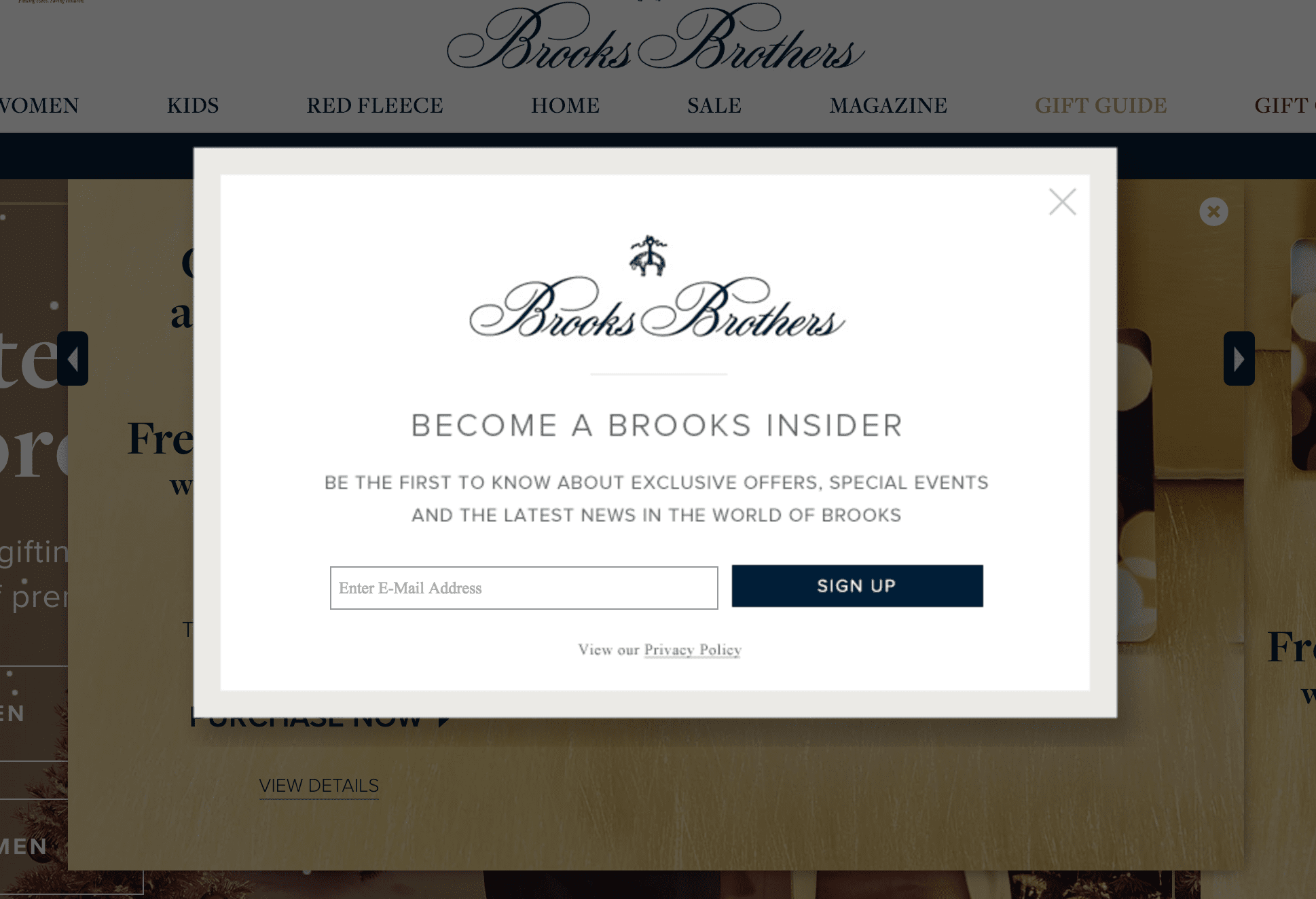
One (pretty value-less) popup that I click out of, only to be followed by another one:
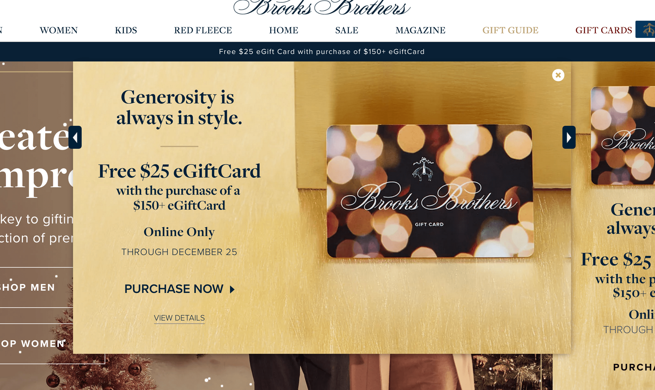
Now, there’s just a lot of clutter going on here. Different colors, different offers, different banners. As a first time visitor, I’m not sure what’s going on. Plus, they have animated snowfall, which adds to the clutter.
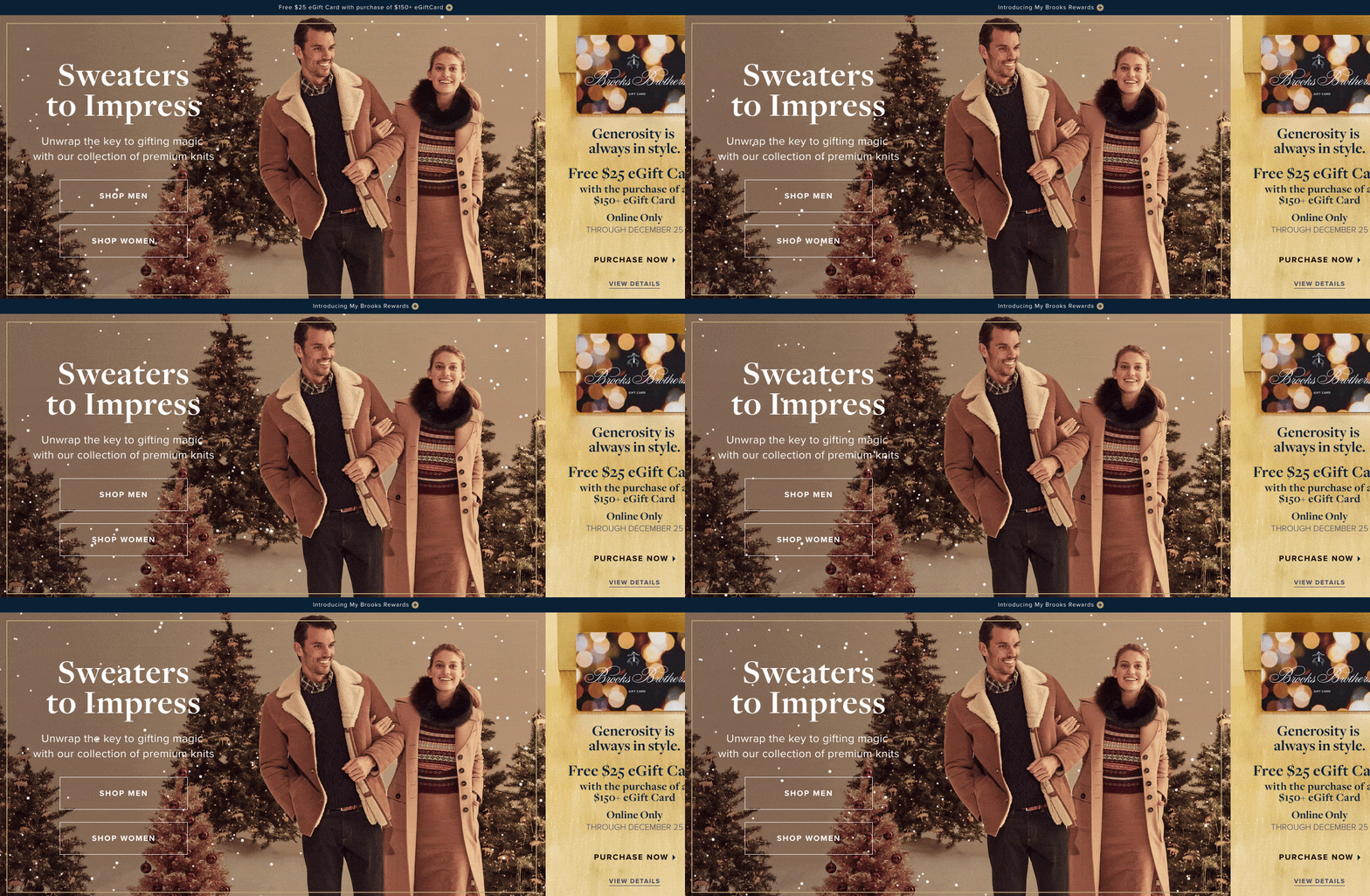
This is quite extreme, but it’s not uncommon for marketers to see some results with a popup and go overboard, triggering two, three, even four in a single session. When all of this occurs within 10 seconds of being on the site, things get annoying quickly.

Take down too many popups: Simplify and strategically target any popups on your site. They shouldn’t appear everywhere for everyone, your targeting is key.

The lesson

Popups don’t need to be annoying. Rather, they can actually add to the user experience if you put a little time and effort into analysis and creative targeting and triggering.

If you avoid the mistakes here, not only will your popups be less likely to feel intrusive, but they’ll convert better and they’ll convert the types of subscribers and leads you actually want.

Run a popup experiment of your own See Unbounce templates you can get up and running today.
Unbounce

Friday, 30 March 2018

Daily Search Forum Recap: March 30, 2018

Here is a recap of what happened in the search forums today, through the eyes of the Search Engine Roundtable and other search forums on the web...

Search Engine Roundtable

Search Buzz Video Recap: Google Mobile First Indexing Release, Algorithm Updates, Bing Search & More

This week was pretty hectic in the search world. Google announced they are beginning to roll out the mobile first indexing process, although I donât think it rolled out yet...

Search Engine Roundtable

#Zenith Keynote Q&A: Adam Singer – Digital Insight Unleashed

Adam Singer embodies the drive, focus and data-driven mindset inherent among today’s digital marketing pros. As Analytics Advocate at Google, Adam lives at the epicenter of search analytics. He sees trends and shapes how analytics can benefit marketers and brands around the world.

Adam’s stated personal mission is to “be a catalyst for all industries and company types to transform how they work using data.” As one of the #Zenith 2018 keynote speakers, Adam will impart his wisdom and vision to help marketers break new ground in their search marketing programs.

We caught up with Adam in advance of Zenith to get a better sense of who he is and the type of insights he’ll share with Zenith attendees. The following Q&A unveils interesting aspects of an individual truly shaping the digital landscape. 

Aimclear (AC): Your professional bio describes you as the Analytics Advocate at Google, startup advisor, investor and blogger. That’s a lot of hats. How would you describe your occupation? 

Adam Singer (AS): I think it’s actually quite common in Silicon Valley (or in the tech sector in general) to be interested in many sectors and skillsets. During my previous life as a consultant, I decided to accept a role with a big company six years ago, but personally still wanted a view into more areas of the world. I had already been a trends blogger on my own site and for industry trade publications since the early 2000s.  Investing and advisement was actually a natural extension of that. But really, the common theme through my work is using data to make decisions, whether that’s predicting where I think markets are headed or helping a company develop the right digital strategy.

AC: At Google, you are in the catbird seat to watch the evolution of data in the digital marketing universe. What do you see as the big opportunities for marketers today?

AS: Building the right attribution model for your company or clients is really what everyone should be doing to effectively credit all their channels. The best part is this used to require a lot of work, but now the tools are totally free for everyone and you can easily see and understand how channels work together. It’s an area of huge opportunity, because while practitioners at the vanguard appreciate marketing attribution and thinking across channels, I think many are so ingrained in a last-click world still, which can hinder performance greatly. Additionally – and this has always been true – knowing which metrics matter and focusing on measuring/improving those while tuning out the noise has always been the secret to success for performance marketers (which now also include brand marketers, not just direct).

AC: Let’s flip the notion – what do you see as the big challenges for marketers today as they live in a data-frenzied environment?

AS: It’s all about both having efficient processes and knowing where to spend time. Marketers have always suffered to some extent from shiny object syndrome which is fine for five percent of your time to test new things. Ultimately, why aren’t marketers heads-down focusing on making the channels and tactics that work for them really shine? I think you see the difference among practitioners who have been at this for a decade+ or those who ran their own business moreso than those who have never left their ivory towers of large brands.

AC: There is a lot of chatter about machine learning, AI, voice search, etc., which can overwhelm marketers. How should marketers of various skill levels forge new paths? Is there a risk of going in the wrong direction and becoming the 8-track tape of marketing?

AS: If I were a practitioner, I wouldn’t spend time “worrying” about machine learning. Actually, it’s really the opposite notion. All these new technologies will get integrated into tools to make all our lives easier. There’s no “easy button” in Google Analytics, for example. You need a human to interpret the data. Even with improvements to things like Analytics Intelligence, someone needs to actually ensure that any recommendations get put into place. We’re a long way from having marketing or analyst work be fully automated by robots (likely never will happen fully in our lifetimes, because good creative is timeless). I would focus on making excellent campaigns and delighting users. Marketers who can do that will thrive no matter the tools or tactics.

AC: You will keynote at Zenith 2018 in Duluth. Can you give us a preview of what you’ll cover with the audience?

AS: In a world increasingly saturated with data and information, visualizations are a potent way to break through the clutter, tell your story and persuade people to action. Raw statistics by themselves are fine. But showing data in context, whether with a simple chart or more creatively in an interactive form, is the future of sharing information. Such an approach needs to be embedded in the thinking of all communications professionals. I think this is really a “last mile” effort for marketers. You create a great campaign, drive sales and revenue, and then move on to the next one. But if you spend just a little more time at the end articulating results, whether internally or to other stakeholders, you can be seen as more strategic, increase next year’s budget or ultimately show you are the leader in a given sector.

AC: If the audience can really internalize one or two key highlights, what do you hope they leave with? 

AS: First, make your visualization as simple as possible (but not simpler) and have a call to action for what people should take away. Just like in a blog post you wouldn’t “bury the lead” as they say, make a call out when you are doing any reporting or data storytelling and tell the stakeholder what they should take away. Do this while considering how busy a CEO or CMO is and you’ll win every time.

Second, it’s okay if your numbers aren’t great! Rome was not built in a day and many of my most successful clients or programs started off with a whole bunch of zeros. As long as you start somewhere and show progress, no one is going to be upset with that and the transparency it creates forms the right long-term trust with your teams. Where you get into trouble is if you fail to be transparent and report results. Typically, that never ends well.

AC: We’ll have marketers of all experience levels in the room at Zenith, including some people just starting out – as well as some college students hoping to launch marketing careers. What advice do you have for people just getting into the game?

AS: Keeping your analysis skills sharp is probably the single most important thing you can do. Good marketers know not just how to record metrics and what KPIs matter, but how to use that data to influence decisions at the strategy table and get buy in for new projects. This involves both left and right brain thinking, as you can get pretty creative with how you use numbers to tell a story. Becoming proficient with data-driven storytelling requires lots of practice, so working on it daily is helpful. Moreso, there’s big demand for analytics-savvy professionals, which means this skill will provide a competitive advantage.

AC: Fun stuff: Tell us a little about yourself. What is your personal story, hidden talent, conversation starter or something that gives you great pride? 

AS: For the last two decades, I’ve used my free time to write electronic and jazz music. I’ve actually written seven original albums and am working on post-production for my 8th right now. I’m not sure if I am actually talented, but it’s just something I enjoy doing.

AC: Freebie: Anything else you’d like to share with the Aimclearblog audience? 

AS: Take our Google Analytics Academy courses. They are free, open to all and one of the best ways to learn analytics from our team at Google.


Be sure to catch Adam’s keynote during the Zenith Conference in Duluth. He takes the Zenith stage Thursday, April 26 at 3:45 pm in Duluth’s famed Greysolon Ballroom.

Also, be sure to check out Adam’s music at Soundcloud.com/adamsinger and follow him on Twitter.

Whatever you do, don’t miss his keynote during #Zenith 2018.


Aimclear® Blog

How to Target Featured Snippet Opportunities - Whiteboard Friday

Posted by BritneyMuller

Once you"ve identified where the opportunity to nab a featured snippet lies, how do you go about targeting it? Part One of our "Featured Snippet Opportunities" series focused on how to discover places where you may be able to win a snippet, but today we"re focusing on how to actually make changes that"ll help you do that. Give a warm, Mozzy welcome to Britney as she shares pro tips and examples of how we"ve been able to snag our own snippets using her methodology.

Target featured snippet opportunities

Click on the whiteboard image above to open a high-resolution version in a new tab!

Video Transcription

Today, we are going over targeting featured snippets, Part 2 of our featured snippets series. Super excited to dive into this.

What"s a featured snippet?

For those of you that need a little brush-up, what"s a featured snippet? Let"s say you do a search for something like, "Are pigs smarter than dogs?" You"re going to see an answer box that says, "Pigs outperform three-year old human children on cognitive tests and are smarter than any domestic animal. Animal experts consider them more trainable than cats or dogs." How cool is that? But you"ll likely see these answer boxes for all sorts of things. So something to sort of keep an eye on. How do you become a part of that featured snippet box? How do you target those opportunities?

Last time, we talked about finding keywords that you rank on page one for that also have a featured snippet. There are a couple ways to do that. We talk about it in the first video. Something I do want to mention, in doing some of that the last couple weeks, is that Ahrefs actually has some of the capabilities to do that all for you. I had no idea that was possible. Really cool, go check them out. If you don"t have Ahrefs and maybe you have Moz or SEMrush, don"t worry, you can do the same sort of thing with a Vlookup.

So I know this looks a little crazy for those of you that aren"t familiar. Super easy. It basically allows you to combine two sets of data to show you where some of those opportunities are. So happy to link to some of those resources down below or make a follow-up video on how to do just that.

I. Identify

All right. So step one is identifying these opportunities. You want to find the keywords that you"re on page one for that also have this answer box. You want to weigh the competitive search volume against qualified traffic. Initially, you might want to just go after search volume. I highly suggest you sort of reconsider and evaluate where might the qualified traffic come from and start to go after those.

II. Understand

From there, you really just want to understand the intent, more so even beyond this table that I have suggested for you. To be totally honest, I"m doing all of this with you. It"s been a struggle, and it"s been fun, but sometimes this isn"t very helpful. Sometimes it is. But a lot of times I"m not even looking at some of this stuff when I"m comparing the current featured snippet page and the page that we currently rank on page one for. I"ll tell you what I mean in a second.

III. Target

So we have an example of how I"ve been able to already steal one. Hopefully it helps you. How do you target your keywords that have the featured snippet?

  • Simplifying and cleaning up your pages does wonders. Google wants to provide a very simple, cohesive, quick answer for searchers and for voice searches. So definitely try to mold the content in a way that"s easy to consume.
  • Summaries do well. Whether they"re at the top of the page or at the bottom, they tend to do very, very well.
  • Competitive markup, if you see a current featured snippet that is marked up in a particular way, you can do so to be a little bit more competitive.
  • Provide unique info
  • Dig deeper, go that extra mile, provide something else. Provide that value.

Examples

What are some examples? So these are just some examples that I personally have been running into and I"ve been working on cleaning up.

  • Roman numerals. I am trying to target a list result, and the page we currently rank on number one for has Roman numerals. Maybe it"s a big deal, maybe it"s not. I just changed them to numbers to see what"s going to happen. I"ll keep you posted.
  • Fix broken links. But I"m also just going through our page and cleaning it. We have a lot of older content. I"m fixing broken links. I have the check my listings tool. It"s a Chrome add-on plugin that I just click and it tells me what"s a 404 or what I might need to update.
  • Fixing spelling errors or any grammatical errors that may have slipped through editors" eyes. I use Grammarly. I have the free version. It works really well, super easy. I"ve even found some super old posts that have the double or triple spacing after a period. It drives me crazy, but cleaning some of that stuff up.
  • Deleting extra markup. You might see some additional breaks, not necessarily like that ampersand. But you know what I mean in WordPress where it"s that weird little thing for that break in the space, you can clean those out. Some extra, empty header markup, feel free to delete those. You"re just cleaning and simplifying and improving your page.

One interesting thing that I"ve come across recently was for the keyword "MozRank." Our page is beautifully written, perfectly optimized. It has all the things in place to be that featured snippet, but it"s not. That is when I fell back and I started to rely on some of this data. I saw that the current featured snippet page has all these links.

So I started to look into what are some easy backlinks I might be able to grab for that page. I came across Quora that had a question about MozRank, and I noticed that — this is a side tip — you can suggest edits to Quora now, which is amazing. So I suggested a link to our Moz page, and within the notes I said, "Hello, so and so. I found this great resource on MozRank. It completely confirms your wonderful answer. Thank you so much, Britney."

I don"t know if that"s going to work. I know it"s a nofollow. I hope it can send some qualified traffic. I"ll keep you posted on that. But kind of a fun tip to be aware of.

How we nabbed the "find backlinks" featured snippet

All right. How did I nab the featured snippet "find backlinks"? This surprised me, because I hardly changed much at all, and we were able to steal that featured snippet quite easily. We were currently in the fourth position, and this was the old post that was in the fourth position. These are the updates I made that are now in the featured snippet.

Clean up the title

So we go from the title "How to Find Your Competitor"s Backlinks Next Level" to "How to Find Backlinks." I"m just simplifying, cleaning it up.

Clean up the H2s

The first H2, "How to Check the Backlinks of a Site." Clean it up, "How to Find Backlinks?" That"s it. I don"t change step one. These are all in H3s. I leave them in the H3s. I"m just tweaking text a little bit here and there.

Simplify and clarify your explanations/remove redundancies

I changed enter your competitor"s domain URL — it felt a little duplicate — to enter your competitor"s URL. Let"s see. "Export results into CSV," what kind of results? I changed that to "export backlink data into CSV." "Compile CSV results from all competitors," what kind of results? "Compile backlink CSV results from all competitors."

So you can look through this. All I"m doing is simplifying and adding backlinks to clarify some of it, and we were able to nab that.

So hopefully that example helps. I"m going to continue to sort of drudge through a bunch of these with you. I look forward to any of your comments, any of your efforts down below in the comments. Definitely looking forward to Part 3 and to chatting with you all soon.

Thank you so much for joining me on this edition of Whiteboard Friday. I look forward to seeing you all soon. See you.

Video transcription by Speechpad.com


Sign up for The Moz Top 10, a semimonthly mailer updating you on the top ten hottest pieces of SEO news, tips, and rad links uncovered by the Moz team. Think of it as your exclusive digest of stuff you don"t have time to hunt down but want to read!

The Moz Blog