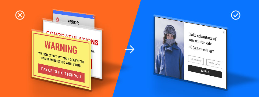
Depending on who you talk to, website popups are either a godsend for list building and subsequent revenue creation, or they’re a nuclear bomb for the user experience.
Some can’t stand popups and completely disregard sites that use them (or that’s what they say, at least). And there are even entire websites dedicated to hating on especially bad popups.
However, many marketers are fully charmed to their capabilities for revenue generation, lead collection, and driving attention and conversions in general.
It doesn’t have to be an either/or situation, though.
You can create website popups that aren’t detrimental to the user experience; In fact, if you do it really well, you can even improve the user experience with the right offer and presentation.
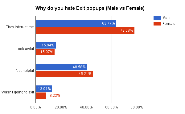
We all want to be companies that care a lot about our visitors and make the best popups possible, so it goes without saying, we care about timing, targeting, and triggering (i.e. who we send offers to, when we send them, and what those offers are). After all, the main reasons visitors get annoyed by popups are 1) when they disrupt the user experience and 2) when they offer no value or help:
Fortunately, you can easily solve for these things. In this article I’ll outline common website popup mistakes with real examples, and I’ll cover a few ways to remedy these mistakes.
Mistake 1: Poor timing
One of the biggest mistakes marketers make with website popups is with timing. It’s almost always the case that we trigger popups too soon (i.e. right away, no matter the context of the page or visitor).
On an Inbound.org discussion, Dustin J. Verburg had this to say:
“The most hilarious popups are the ones that say ‘LOVE THIS CONTENT? SUBSCRIBE FOR MORE’ because they assault my eyes before I even read two words of the article.
Now I guess I’ll never know if I love the content, because I close the tab immediately and never come back.”
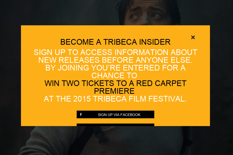
Similar to Dustin, imagine you’re taking break from work to check out GrowthHackers. You find an article on the front page that looks interesting. You open it and immediately get this:
Woah, what’s this full screen takeover? I know this is common today, but most people are jarred by this experience.
Now you may not even remember what the article was, so you’re likely to click away and go back to actual work.
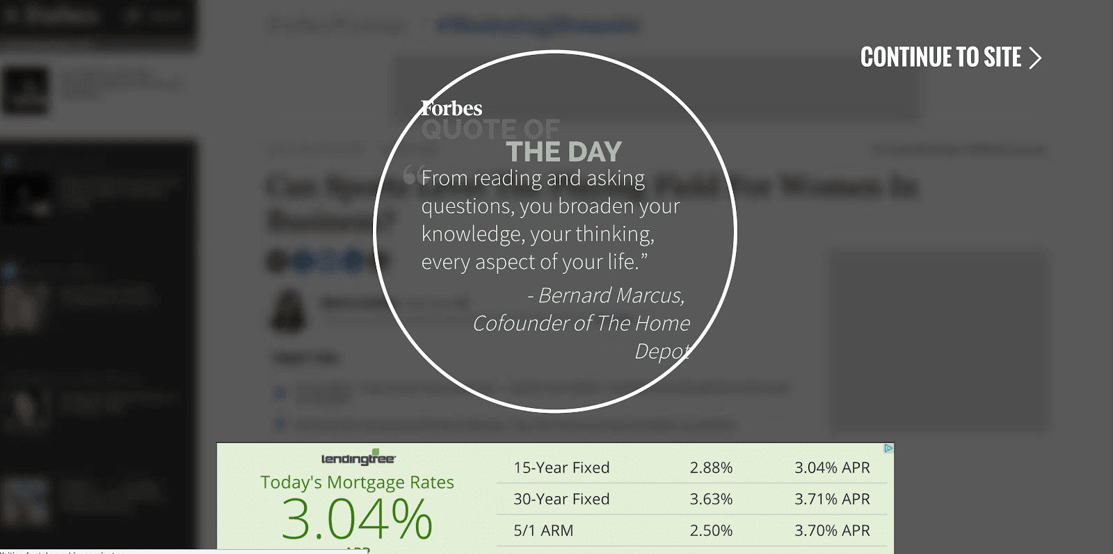
One possible way to remedy this – just spitballing here – could be to add some copy explaining that the visitor needs to click to continue on to the article. Forbes does this (though Forbes could never claim a good user experience without a good laugh):
At least you know where you’re at (the logo is prominent) and what to do (continue to site). But, it goes without saying, Forbes’ experience is not ideal so don’t copy it.
So how do you fix poor timing?
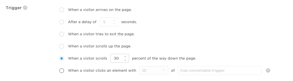
The best possible solution for user experience is to trigger a popup at a time that actually benefits a visitor. On a long-form blog article, this is usually at some point of strong user engagement, either measured by time on site or, better, by scroll-depth and content engagement.
You can do this with an on-scroll popup created in Unbounce.
Once you’re happy with your design, simply set your trigger for when someone scrolls through a certain percentage of the page, or even after a delay you specify:
Click above for a larger, clearer image.
Overall, poor timing is a common problem, and it’s almost never intentional. We simply act hastily when setting up popups, or we spend all of our time crafting the offer and forget that when the offer is shown matters too.
I want to point out, however, that it’s not always a bad decision to throw a popup at visitors on arrival. It’s all about context.
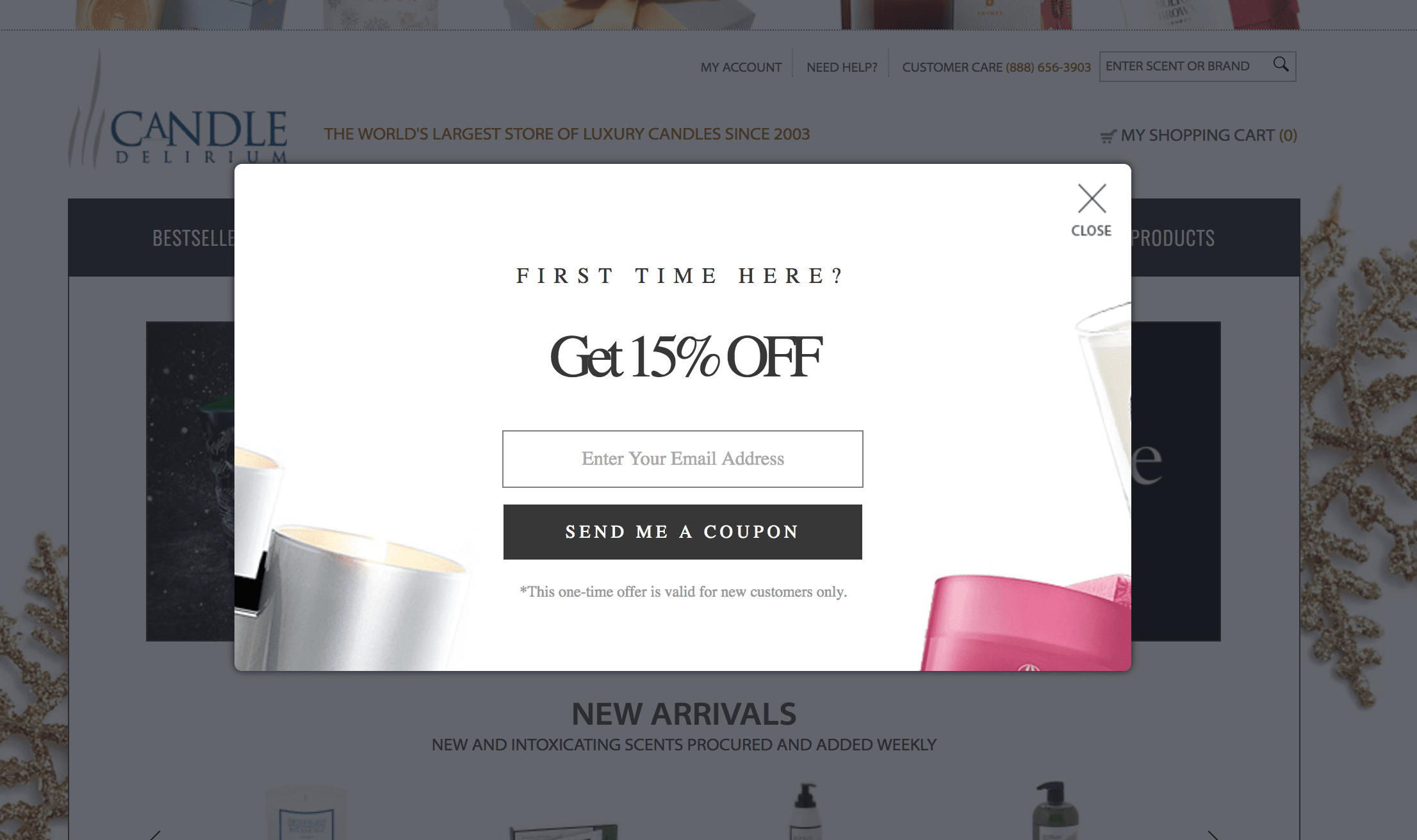
For example, if you’re shopping for clothes, there are a million options available. Therefore, it’s imperative for ecommerce shops to grab your attention as quickly as possible with an attractive offer. This is why you see so many website popups with discounts on arrival on ecommerce sites, like this one from Candle Delirium:
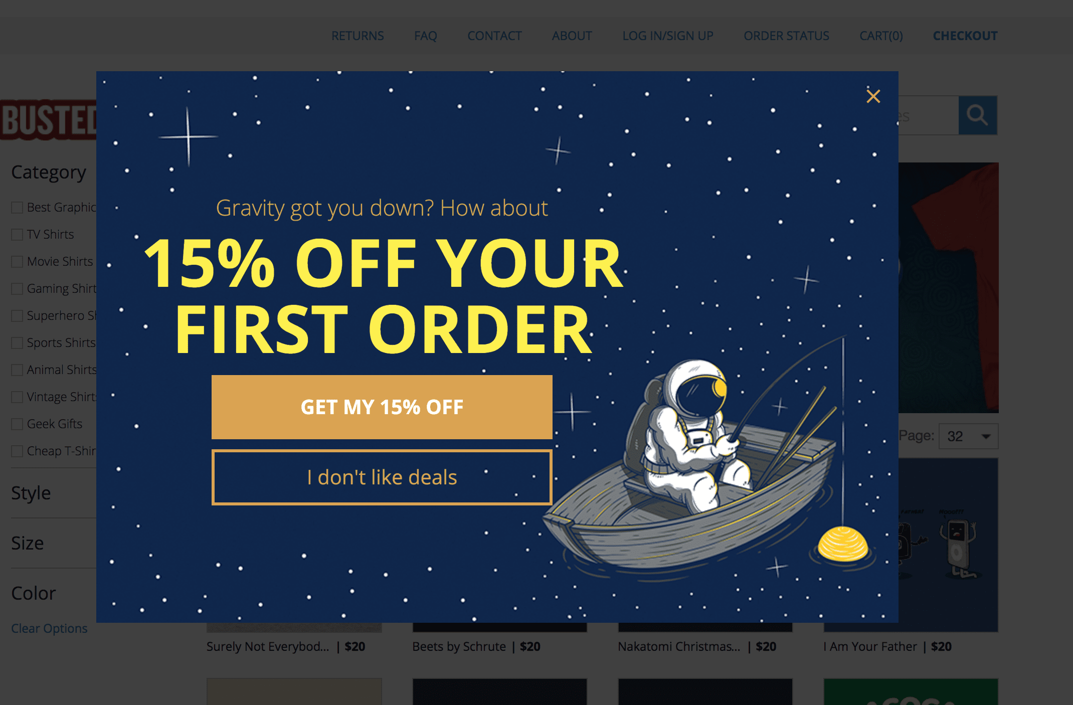
As well as this one from BustedTees:
It’s a very common tactic. We’ll go over it specifically in regard to ecommerce later in section three.
In general, it’s important to analyze a visitor’s behavior and trigger the popup at the exact moment (or as close to it as possible) that someone would want to subscribe/download your offer/etc. It’s a lot of work to tease out when this may be, but the analysis is worth it as you’ll annoy fewer visitors and convert more subscribers or leads.
Fix annoying timing: Consider the user experience. Does it warrant an on-arrival popup? If not, what’s the absolute ideal timing for a popup, based on user intent, behavior, and offer?
Mistake 2: Poor targeting
Poor targeting is a broad problem that’s usually made up of a mismatch between who you’re targeting and what offer you’re sending (though, you could also add in when you’re targeting them as a variable as well).
For instance, if you’re targeting a first time organic visitor to a blog post with a popup that announces a new product feature, you may spur some confusion. Rather, you should try to target based on appropriate user attributes, as well as within the context of where they are in the user journey. A better offer for a first time blog visitor might be an ebook or email course on a topic related to the blog post.
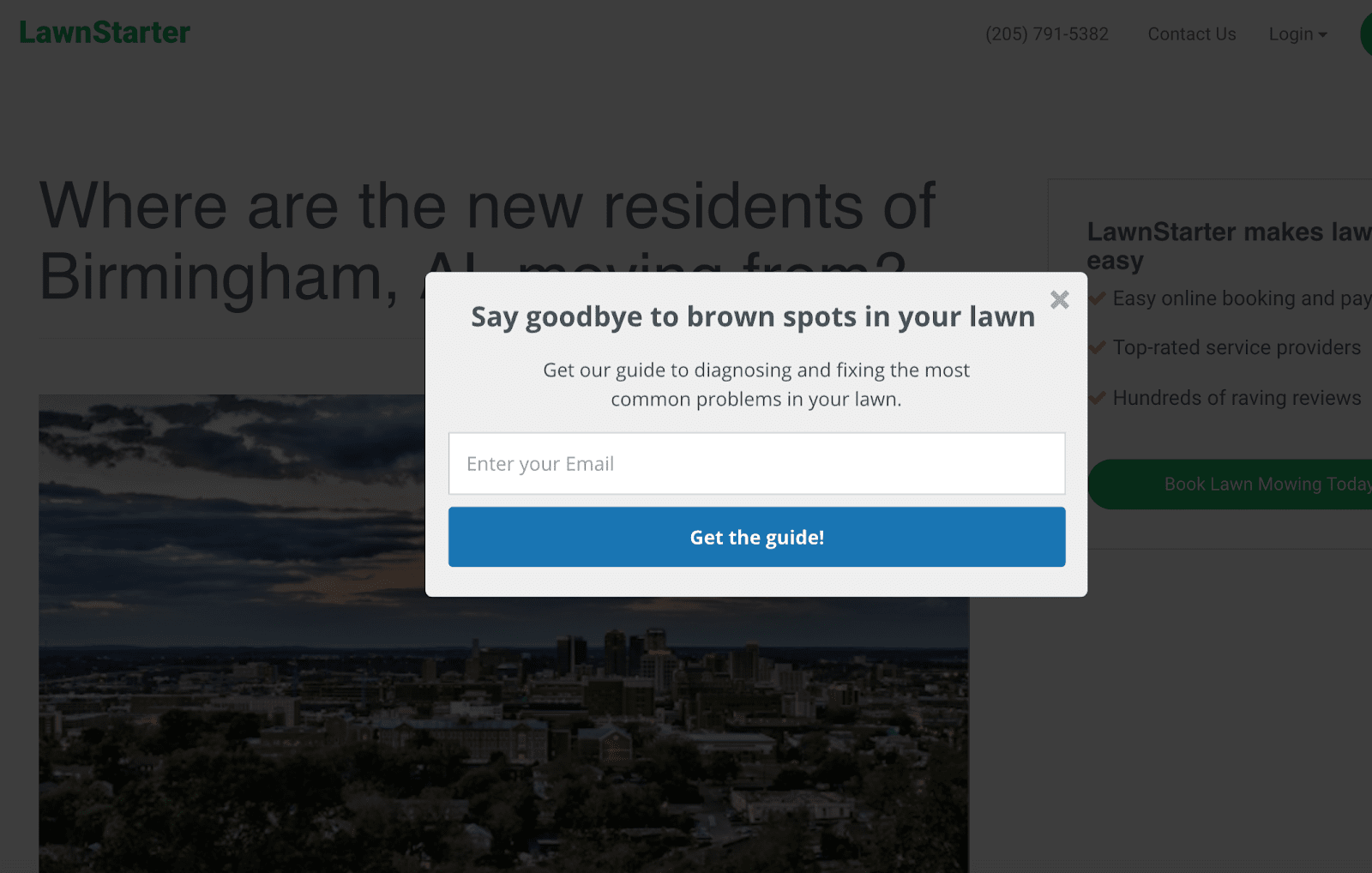
An example of poor targeting is LawnStarter’s guide on their post about where new residents of Birmingham are moving from. It’s a cool infographic-based guide they’re offering up, but the popup is really irrelevant to the content of the post someone’s currently reading in this case:
In another, better example, Mailshake has a massive guide on cold emailing, which would be a daunting read in a single session. It’s probably appropriate, then, that they offer the book up for download via a sticky bar at the bottom of a related article:
There are ways they could improve copy, design, or the offer itself, but the core point is that their targeting is spot on (i.e. after someone’s reading something about cold emailing, and offered up as added, downloadable value).
Now, if I already visited this page and downloaded the playbook, and they still hit me with this offer, then we’d have a targeting problem. They could use the fact that I’m a repeat visitor, as well as a subscriber already, to target me with a warmer offer, such as a deeper email course, a webinar, or possibly even a consultation/demo depending on their sales cycle and buyer’s journey.
The fix for poor targeting
Remember with targeting, you’re simply trying to align your offer with your visitor and where they are in their awareness and interest of your company and product.
This is where the value of progressive profiling comes in. But if you’re not doing that, at the very least you should be aligning the offers on your page with the intent of the traffic on that page.
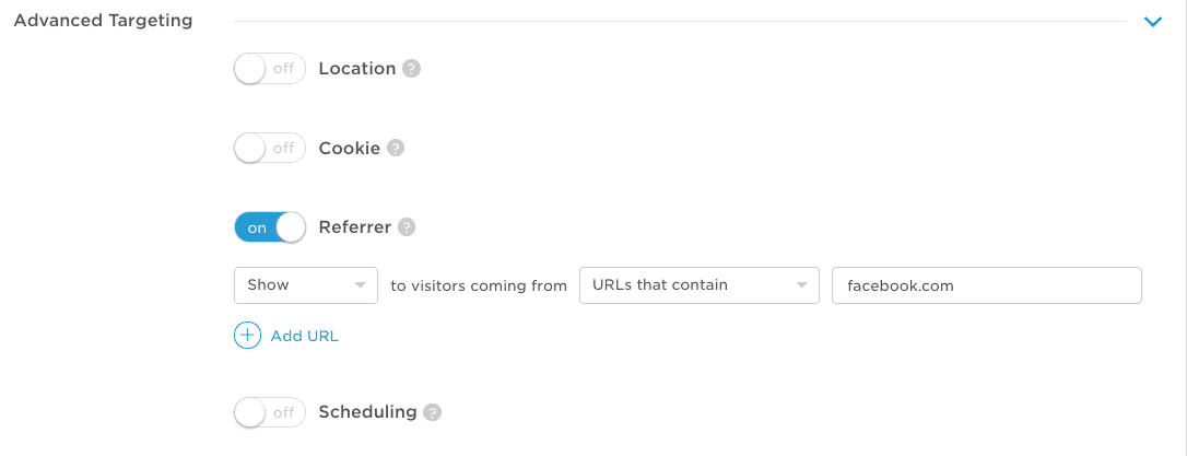
You can also target offers based on URLs, location, referral source, and cookies. Really think about who is receiving your offer and at what point in the customer journey before you set a popup live.
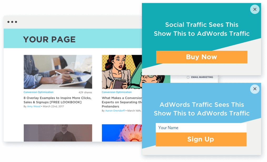
With popups created in Unbounce, for example, you can use referral source as a way to target appropriate offers to someone who’s come from social traffic, vs. someone who’s arrived via AdWords traffic:
Simply create your popup, and in advanced targeting, select which referral sources you’d like to have access to the offer:
Fix targeting the wrong people at the wrong time with the wrong offer Analyze your customer journey and intent levels on content. Craft offers according to customer journey status as well as on-site user behavior.
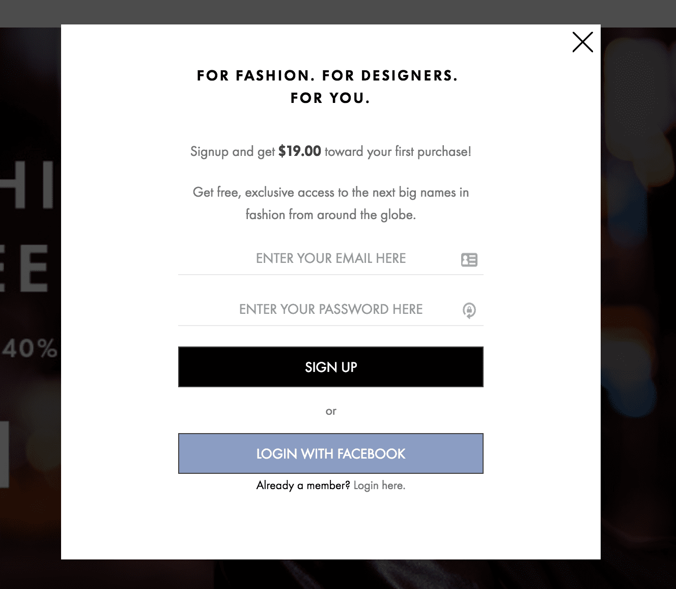
Mistake 3: Offers with no obvious value
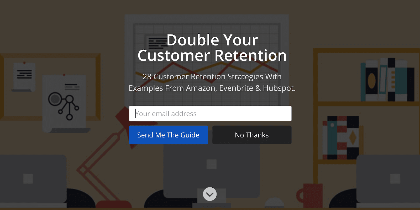
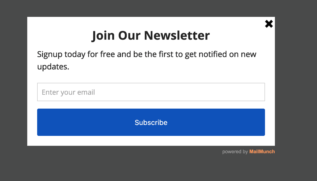
How many times have you been on a blog that simply wants you to sign up for a mailing list, no value promised or given? Like this:
If you’re an active reader of the blog, maybe this works. After all, you already know the value of the content and simply want to sign up for updates. Makes sense. But I’d wager this type of active reader is a small percentage of traffic, and these people will sign up however they can. Thereby the popup isn’t useful for everyone else.
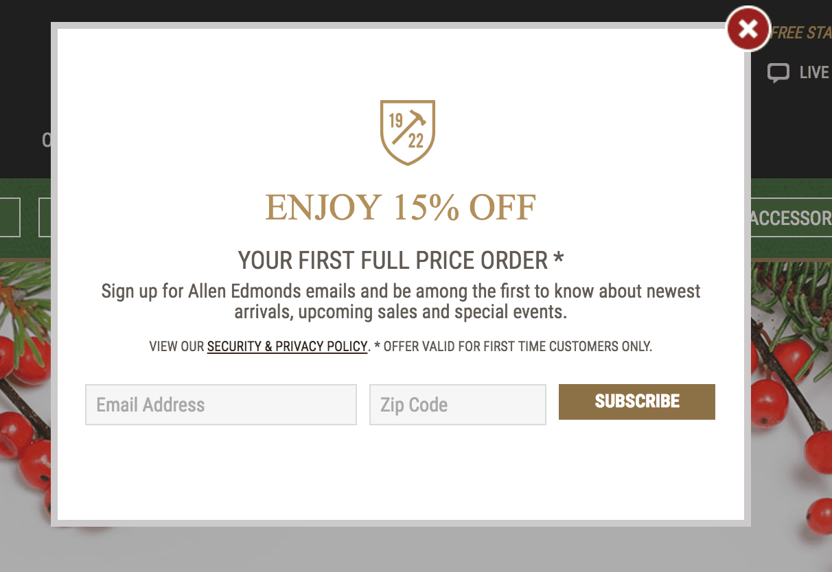
As we covered before, a much better way to capture attention is with a discount, like Allen Edmonds offers here as soon as I land on the site (on another note, this is a great use of an immediate triggering. It’s not an annoying popup when it delivers me a discount).
This is a super common ecommerce tactic.
It’s a competitive world out there, and giving an immediate hit in the form of a discount is a good way to capture some of that oh so valuable attention. It’s especially common when used on first time visitors to the homepage, as a homepage visitor’s experience is generally more variable and less intent-based (if they land on a product page from a search ad, it’s a bit of a different story).
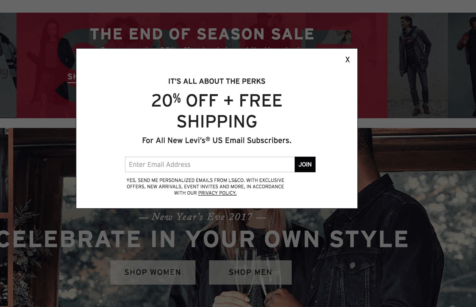
Here’s an example from Levi’s:
The fact that most ecommerce sites have similar messages nowadays is indicative of a creativity problem, one that presents itself to marketers in any industry. We look to competitors and to the consensus and think that we can’t fall behind, so we replicate tactics.
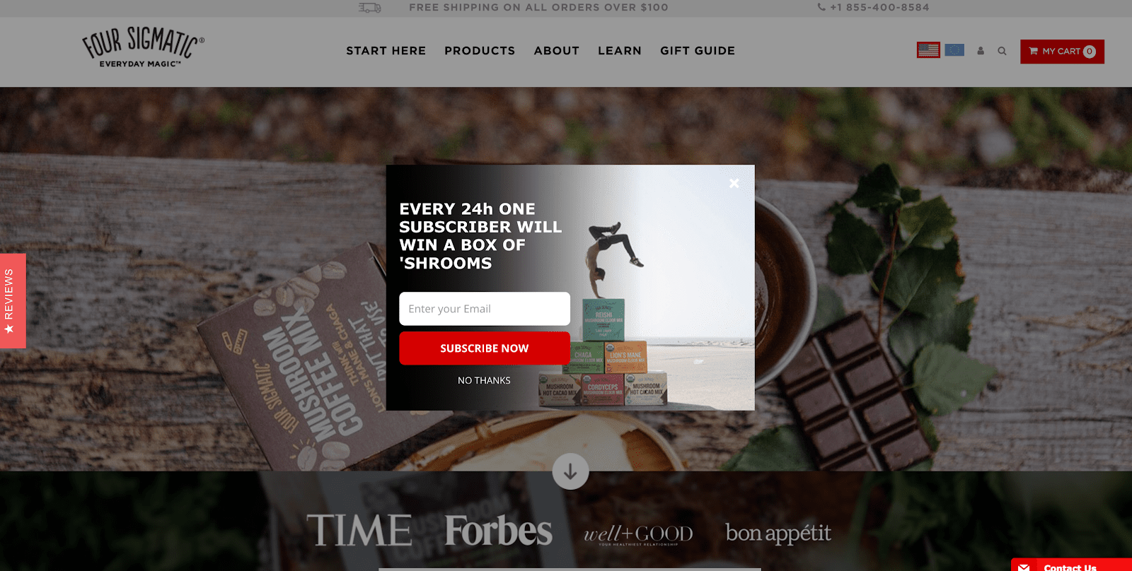
However, I’m more interested in sites, like Four Sigmatic, that push beyond and implement a creative offer, like their lottery style subscription featured below. (This is one of the only popups I’ve signed up for in months, by the way):
Offering up poor or no value is really the least forgivable mistake if you’re a marketer. Crafting offers that align to your buyer persona is your job. Also, it’s fun. If you have a bland offer, this could easily be the biggest opportunity for lifting conversions, as well as improving the user experience (no one is complaining about awesome offers).
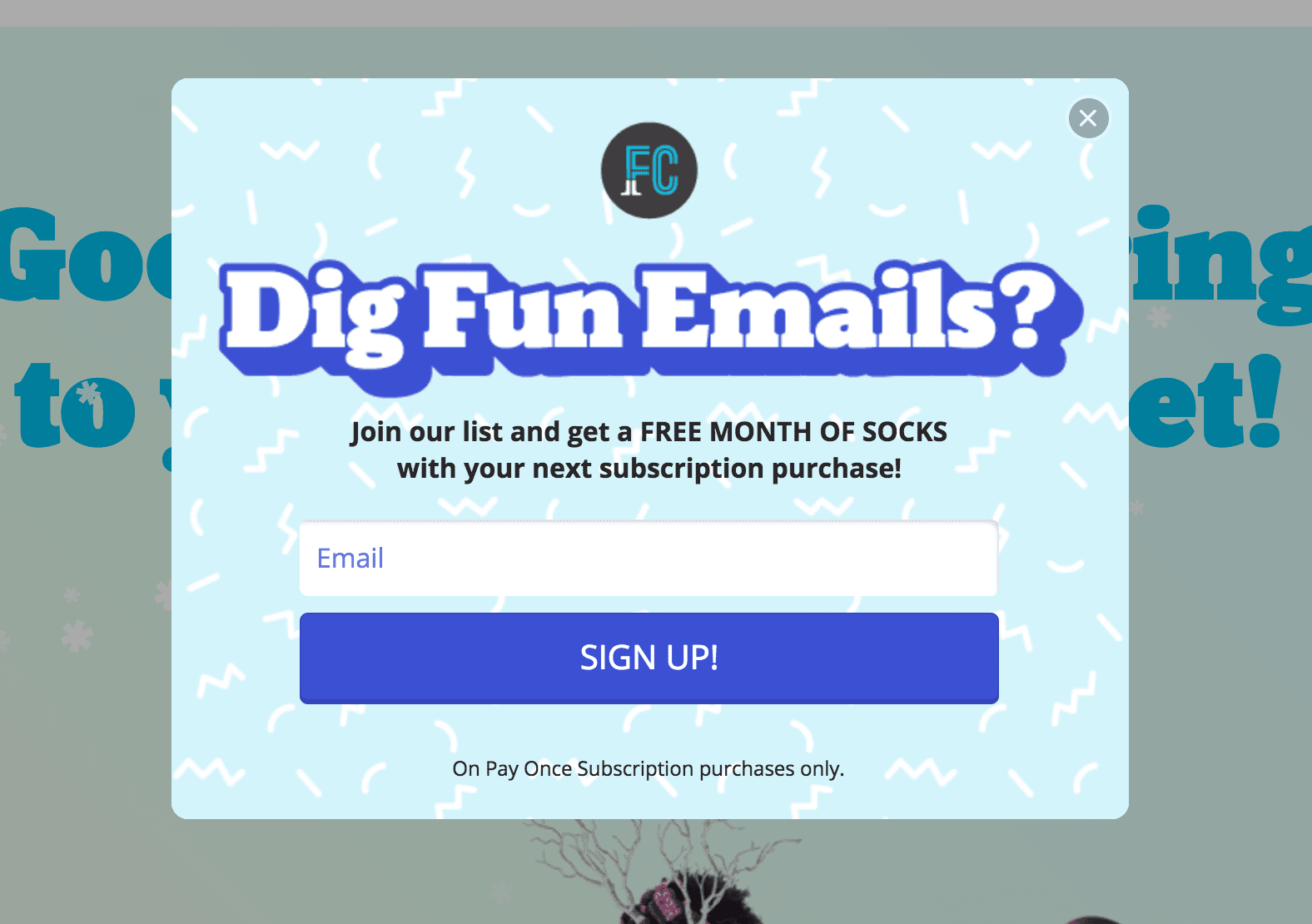
Foot Cardigan does a really good job of offering value and conveying it in a fun way too:
Triggering popups with zero value? Think about ways you can give massive value to your site visitors, so much that they really want to give you their email, and create an offer for this.
Mistake 4: Poor design
If you use Unbounce Popups, it’s almost hard to create an ugly one. Still though, the internet is filled with eye-sore examples:
Design matters. A poorly designed website element can throw off your whole brand perception, which is important in creating trust, value, and in easing friction.
As Ott Niggulis put it in a ConversionXL article:
“Success in business online is all down to trust. You either see something that makes you trust a vendor or you don’t. Trust is also directly linked to conversions – if people leave your website because it’s so badly designed that it makes you seem untrustworthy then you’re missing out on lost prospects, customers, sales, and profits.
Good design = trust = more conversions = more money in your pocket. It’s as easy as that.”
That same article cites a study where 15 participants were directed to Google health information that was relevant to them, then they were asked about their first impressions of the sites.
Out of all the factors mentioned for distrusting a website, 94% were design related. Crazy!
So don’t just put up a poorly designed popup thinking the message will be the focus. Put some effort into it.
Of course, you don’t always need to look like a luxury brand. If cheap spartan is your schtick, then it can work for you. After all, Paul Graham’s site isn’t pretty but it’s so, so valuable:
Image of Paul Graham’s site.
As Aurora Bedford from NN/g explains it, it’s more about matching design to your brand values and objectives:
“The most important thing to remember is that the initial perception of the site must actually match the business — not every website needs to strive to create a perception of luxury and sophistication, as what is valuable to one user may be at complete odds with another.”
No matter what your brand positioning may be, however, make sure you clean up obvious design mistakes before hitting publish.
Fix up bad design: Spend a few hours longer designing your popup, hire a designer, or use a tool like Unbounce with a template.
Mistake 5: Poor Copy
Presenting your offers with clear copy is huge. Most copywriting, not just on popups but online in general, is:
- Boring
- Vague
- Confusing
- Cringe-inducing
…in that order, I’d wager. Not often do you find crisp, clear, and compelling copy (unless it was whipped up by a professional, of course).
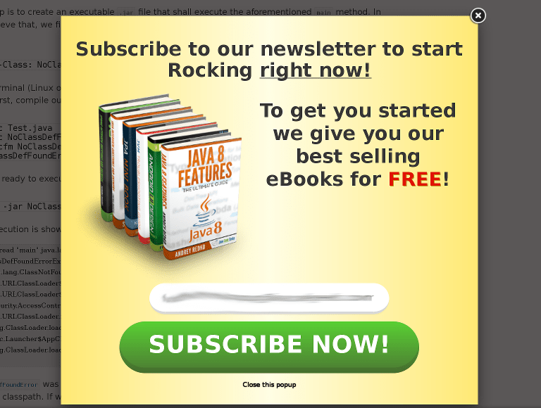
As with the example below, you’re more likely to find copy that’s vague (how many ebooks, which ones, etc.) and cringe-inducing (Rocking with a capital R is pretty goofy):
The copy you write for your popup may be the most effective mechanism you have for converting visitors (outside of the targeting rules). Here’s how Talia Wolf, founder of GetUplift, put it in an Inbound.org comment:
“Many people are trying to capture your customer’s attention too so you need to give them a good reason for subscribing/not leaving.
It’s not enough to talk about yourself, you need to address the customer’s needs: one way is by highlighting the value your customer gains. The other, highlighting what they might lose. (Example: “Join thousands of happy customers” vs. “Don’t lose this unique content we’re giving our subscribers only”
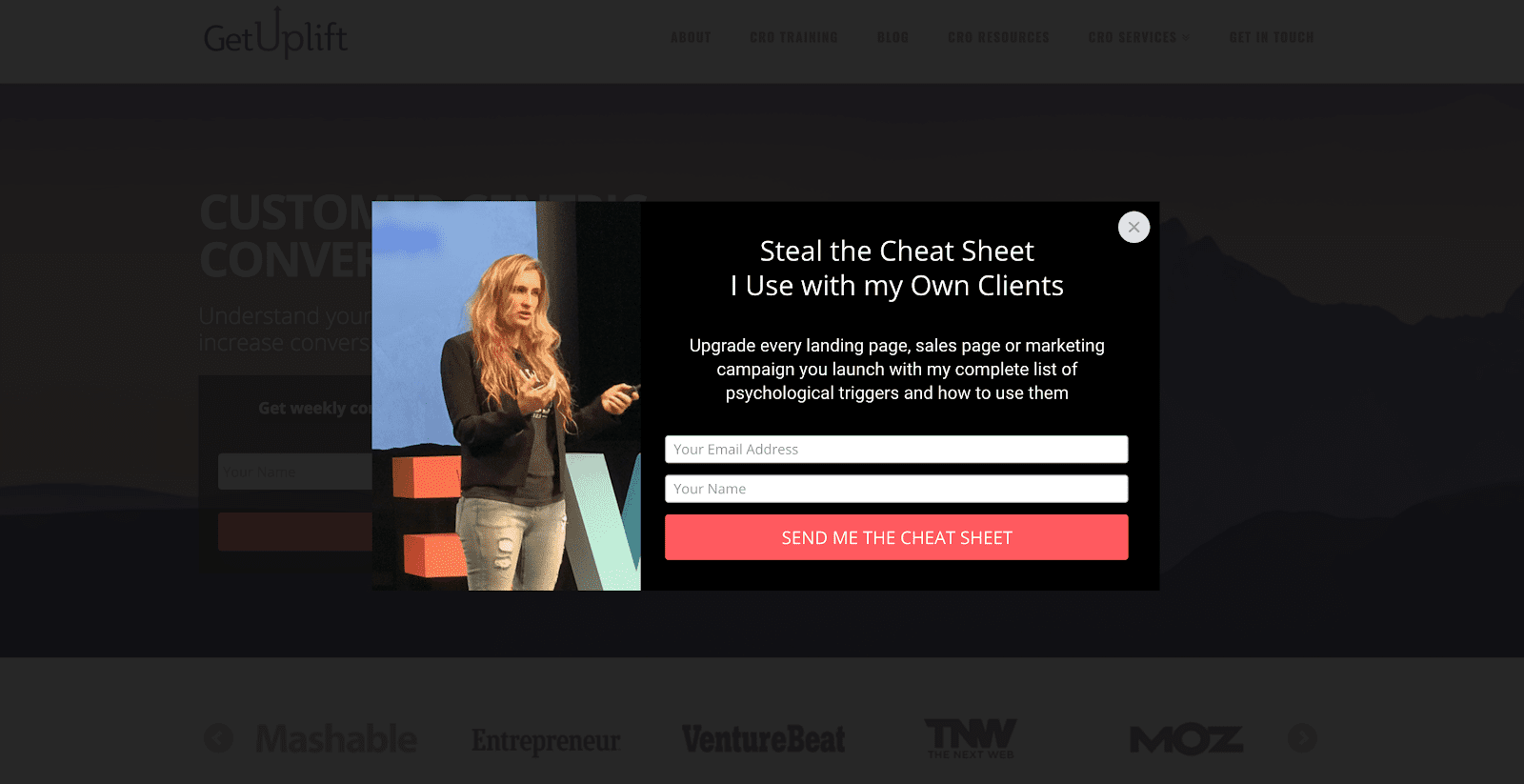
Her website has a solid example of a popup with great copywriting, by the way:
Sometimes, all you need to do is pull your message to the top and make it prominent. Often we try to write clever copy instead of clear copy, but clear always beats clever.
For example, if the following popup led with the money offered for the account, it’d probably be more compelling than their current vague headline:
Mistake 6: Overload
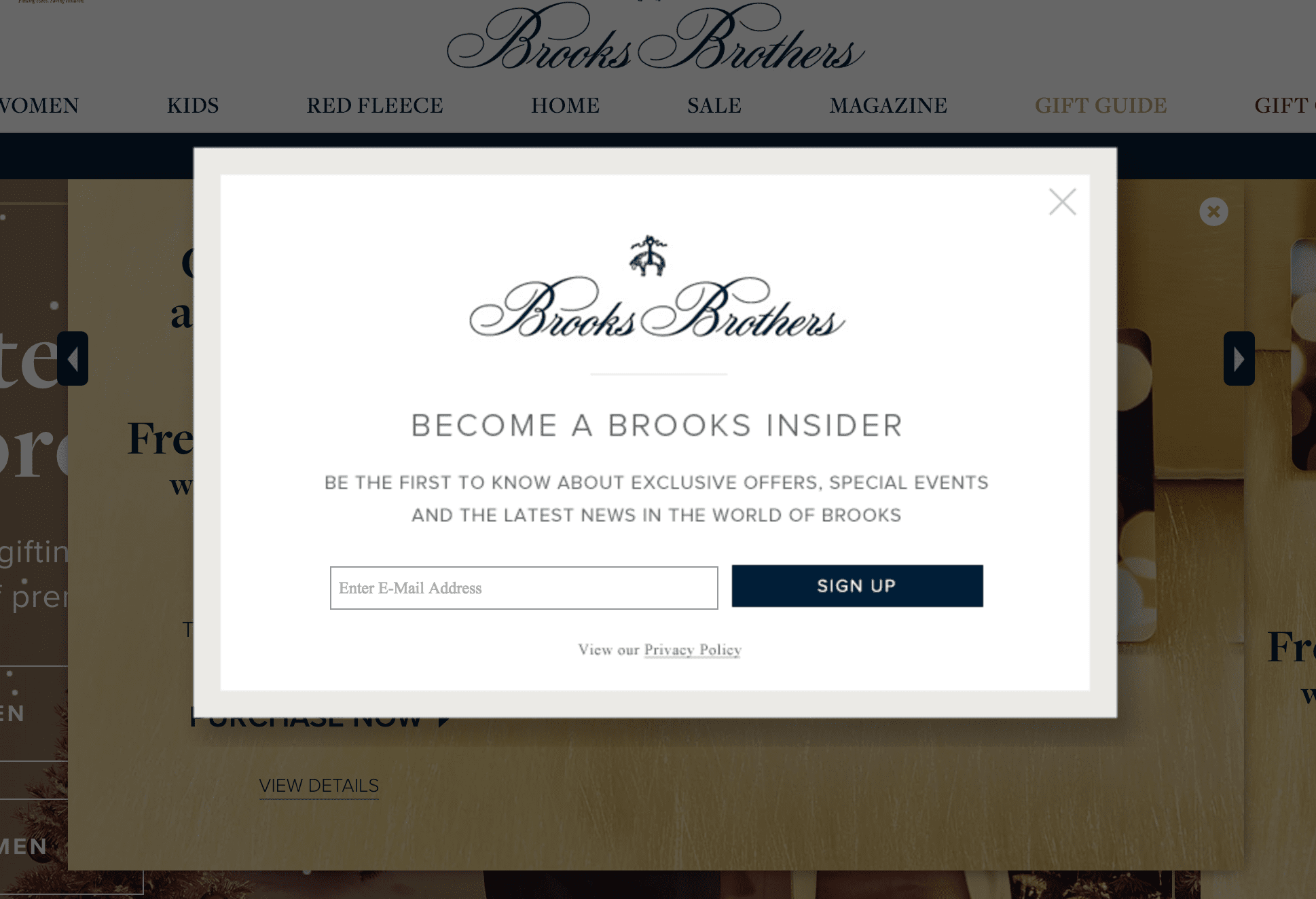
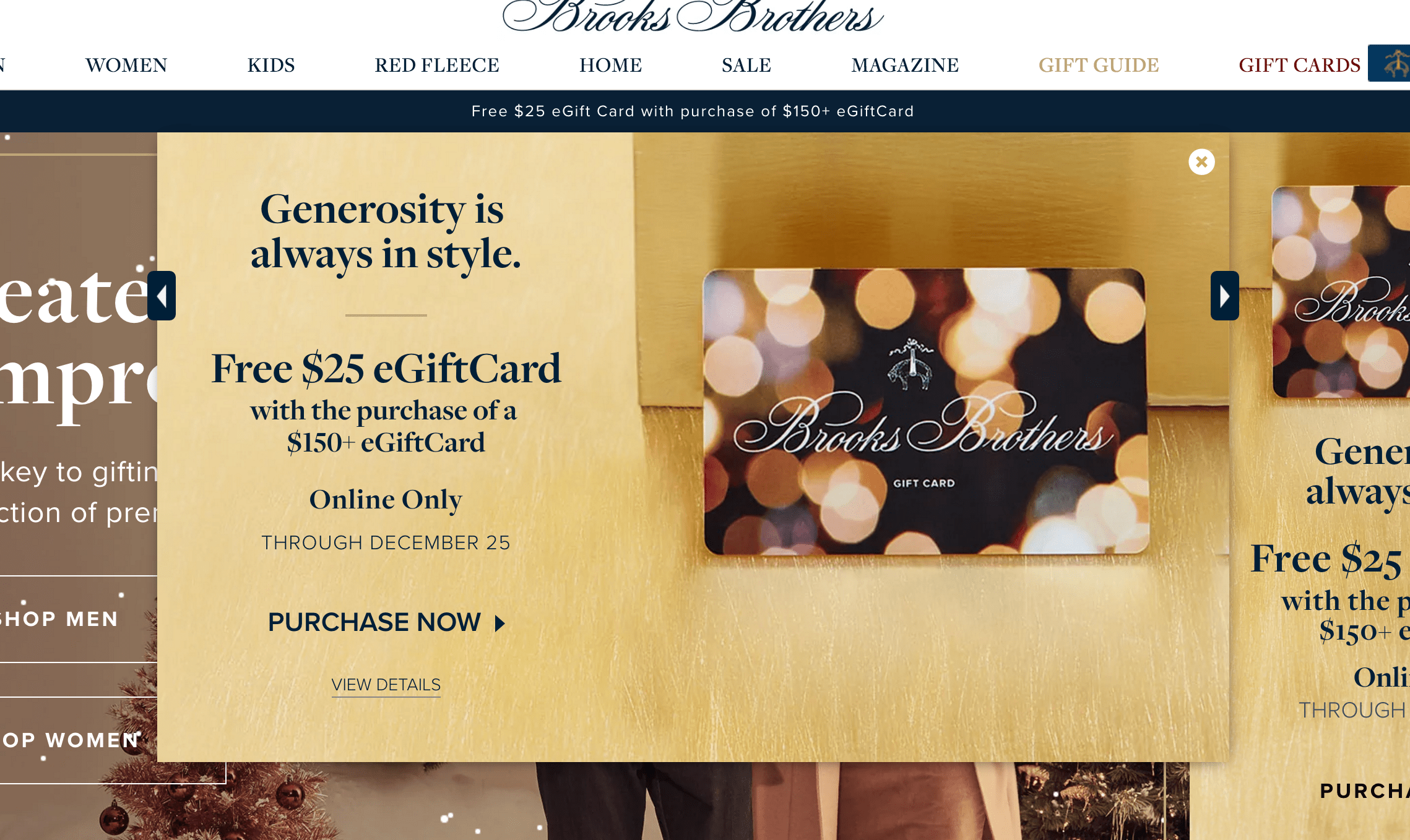
Sometimes websites can get pretty aggressive. Here’s an experience I ran into on Brooks Brothers’ website:
One (pretty value-less) popup that I click out of, only to be followed by another one:
Now, there’s just a lot of clutter going on here. Different colors, different offers, different banners. As a first time visitor, I’m not sure what’s going on. Plus, they have animated snowfall, which adds to the clutter.
This is quite extreme, but it’s not uncommon for marketers to see some results with a popup and go overboard, triggering two, three, even four in a single session. When all of this occurs within 10 seconds of being on the site, things get annoying quickly.
Take down too many popups: Simplify and strategically target any popups on your site. They shouldn’t appear everywhere for everyone, your targeting is key.
The lesson
Popups don’t need to be annoying. Rather, they can actually add to the user experience if you put a little time and effort into analysis and creative targeting and triggering.
If you avoid the mistakes here, not only will your popups be less likely to feel intrusive, but they’ll convert better and they’ll convert the types of subscribers and leads you actually want.
 Unbounce