Google started talking about the Mobile-first indexing since November 04, 2016. At that time, Google announced that they wanted to make some experiments with their algorithm so it would primarily use the mobile version to rank pages from a website, to understand the structured data and to show it accordingly in the mobile search results.
Google’s system for crawling, indexing, and ranking was using the desktop version of the website, which led to lots of issues for mobile searches because the mobile version was most of the times different than the desktop site. Basically, you could have content about dental cleaning on desktop and content about a completely different topic, such as paid loans, on mobile.

To help webmasters in the process, here are five ways to make the shift to a more mobile-focused index less painful and as safe as possible.
- Create Responsive Website and Dynamic Serving Website
- Serve Structured Data for the Desktop and Mobile Version
- Use the Robots.Txt Testing Tool to Verify the Mobile Site
- Add Your Mobile Site in Search Console
- Verify the Crawl Rate
When the official announcement about the mobile-first indexing launch was made on March 26, 2018, that meant Google started using the mobile version on the website for indexing and creating the baseline for how they determined rankings.
| Sites that are not in this initial wave don’t need to panic. Google mobile-first indexing is about how we gather content, not about how content is ranked. Content gathered by mobile-first indexing has no ranking advantage over mobile content that’s not yet gathered this way or desktop content. Moreover, if you only have desktop content, you will continue to be represented in our index. | |
Google’s documentation for mobile-first index explains thoroughly how the mobile content from a site is determined. There are things that don’t need to be changed and others that must be different from the desktop version. Next, we’ve tackled the topic and gathered a handful of best practices.
1. Create Responsive Website or Dynamic Serving Website
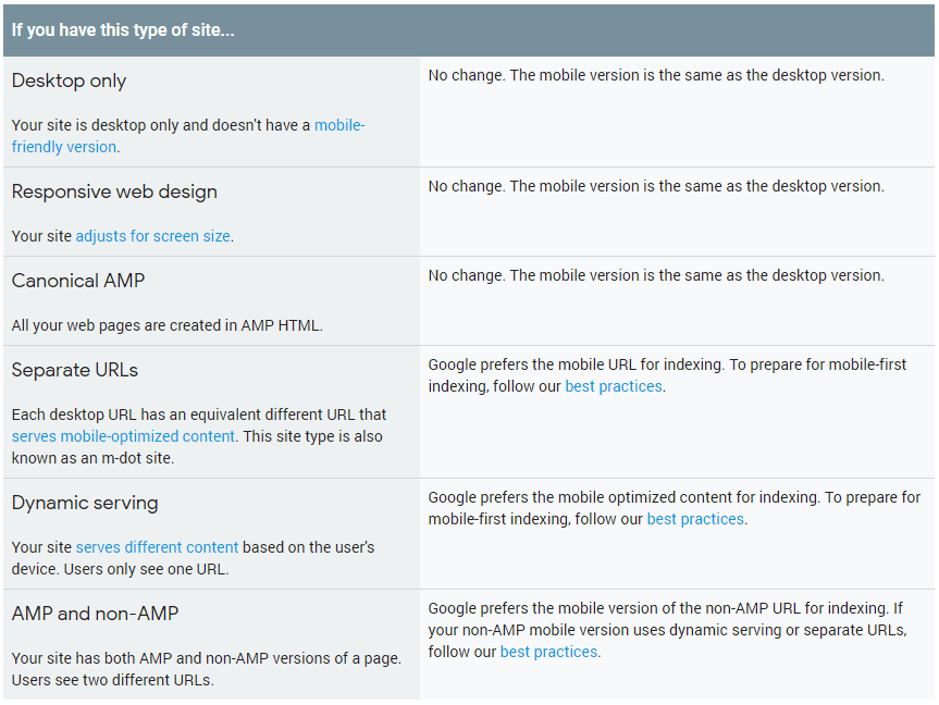
There are three ways to optimize your website for different devices. First, there is the responsive design which allows the user to access the website on the same URL serving the same HTML to all the devices and using CSS to render how content appears on each device. Google recommends using this method. Second, there is the dynamic serving website which serves the users the same URL for all devices but uses different HTML and CSS for each device. And the last one is when the website has a different URL than the mobile version (m-dot website).
If you follow Google’s recommendation, one of the first things you should do to align your website with the mobile-first index is to make it responsive. The interesting features of responsive sites are the fact that they are a great fit for any device due to the sizeable adaptability and that they offer an optimized experience.

Source: developers.google.com
Screen sizes changed from the traditional ones that we know, starting with desktops or notebooks, to phones, then tablets and e-readers. A responsive website must include some of the next elements:
- Flexible text and images (SVGs);
- Fluid grid layout;
- Large clickable area for buttons, scalable font size and other elements to assure usability;
- CSS breakpoints.
In order to have all these elements taken into account, you must be sure you follow the next steps:
- Make everything flexible: layouts, image sizes, text blocks.
- Use image vectors (SVGs) for a better clarity. Unlike raster images, vectors are based on image paths, so they preserve the quality at any size.
- The picture element must be used when a responsive design determines how different images appear on some types of screens.
- Make text accessible. Once you set up a smaller resolution, make sure the text is easy to read and there is sufficient contrast. Don’t use text within graphic, because it will become unreadable in different sizes.
- Create fluid heights and widths.
- Set up a meta viewport tag which gives directions to the browser about the website’s dimension and scale.
- Use at least 3 breakpoints, one for each device, such as mobile, tablet, and desktop. A breakpoint is the media query value that marks the transition to a new class of devices.
To have a well designed responsive website it is best to separate the essential elements from the secondary ones. Nick Babich explains the idea better:
| The mobile-first approach is also a content-first approach. The heart of the site is content — that’s what the users are there for. | |
| Nick Babich | |
| Editor-in-chief of UX Planet / @101babich | |
You can test how your website reacts to different screen resolutions through online tools, like the Responsive design checker or through Chrome browse on Device Mode toolbar, which can be accessed if you click F12.
Having a responsive website is about usability and creating a website that fulfills the needs of lots of other “online consumers”.
For a dynamic serving website, there are other practices. Taking into consideration that a dynamic serving website has a setup where the server responds with different HTML (and CSS) you probably know that Google prefers the mobile-optimized for indexing mobile content. Make sure you follow the next recommendations:
- Have the same content on all the devices to avoid cloaking.
- Use metadata on both versions of your site.
For separate URLs (m-dot type of site), beside the recommendations specified above, you should also follow the next ones:
Firstly, use Search Console to verify both versions for a better functionality and knowledge of your data.
Secondly, check hreflang tags to point to the right version. The mobile URL hreflang must point to the mobile version and the desktop URL hreflang should point to the desktop version.
Aleyda Solis, International SEO Consultant at Orainti, explained through a post on Twitter how the mobile first index versus desktop first index should be set up:
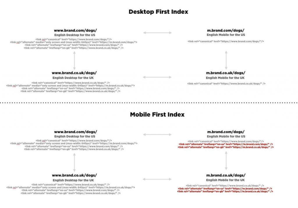
On the same thread, John Mueller recommended the mobile URL hreflang for the mobile version and the desktop one for desktop.
Hi John! Could you please confirm this new hreflang setting for mobile first index with an independent mobile setting then? > https://t.co/vjuiqMYpCp
— Aleyda Solis (@aleyda) November 29, 2017
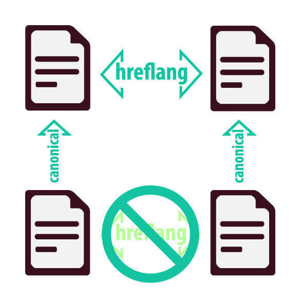
Lastly, ensure the correct rel=canonical and rel=alternate link elements between your mobile and desktop versions. If you use both hreflang and canonical tags, you might send confusing signals to Google and it will end up ignoring your instructions.
Source: www.rebelytics.com
Eoghan Henn, co-founder of searchVIU explained that it is extremely possible to confuse Google if you didn’t implement correctly the tags.
| If you already have a canonical tag solution on your website, which asks Google not to implement certain URLs, and you then add hreflang tags to all of your URLs, you will confuse Google. You will be asking Google to index and not to index certain URLs at the same time. | |
| Eoghan Henn | |
| co-founder of searchVIU | |
There are some other things pointed out in Google Developers documentation regarding mobile-first index you should consider:
2. Serve Structured Data for the Desktop and Mobile Version
On top of all the suggestions and best practices mentioned above, you should consider having structured data for the mobile version of your website also. This method can be applied if you’re having a site configuration of your structured data for the mobile version, compared to the desktop one.
Make sure what data need to be highlighted on mobile, don’t markup data that’s not relevant for mobile users and strictly focus only on the relevant and specific information of each document. Make sure you do don’t overuse the method because you might put your website at penalization risk. We’ve previously talked about the Structured Markup Penalty, which translated into a decrease in traffic because of spammy use of structured markup data.
Use Data Highlighter to provide structured data and organize your content. Make sure you don’t have any errors checking it with the Structured Data Testing Tool.
3. Use the Robots.Txt Testing Tool to Verify the Mobile Site
Robots.txt tells Googlebot that the mobile version is available. Also, it highlights which part of your website must be crawled. It is very important to verify that your robots.txt directives work as you intended for the mobile version of your site, as well as the desktop version.
If you fail to use this or don’t use it, you might give access to Googlebot to content that you wouldn’t want to. There are lots of robots.txt implementation mistakes that happen and could break your rankings. So in case, you have content you don’t want to be indexed (for example, confidential information) you should block or manage various crawlers.
In Search Console, there is the robots.txt Tester tool where you can write or edit robots.txt files for your site.
The robots.txt files have a lot of advantages, such as:
- stop pesky crawlers from eating up all the bandwidth;
- disallow confidential information;
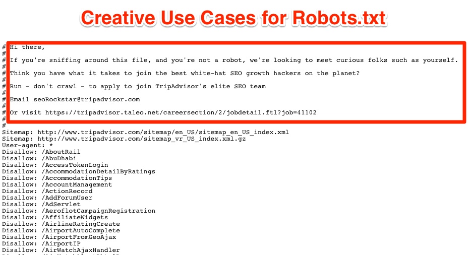
- hire awesome geeks that stalk for hidden messages in your robots.txt file, like the recruiting campaign TripAdvisor created
4. Add Your Mobile Site in Search Console
For sure you authorized your website in Search Console. If you verified your site ownership for the desktop version, why wouldn’t do that for the mobile version?! Miley Oye, member of Google webmaster support team, explains how to verify ownership of your site in Google Search Console:
The steps to add a new property are simple: Add property » Manage property » Verify property. Once you got to this point, you have to download an HTML file to upload it to your website. After that, you need to confirm and verify the website. Below you can see exactly how Google guides you through the process.
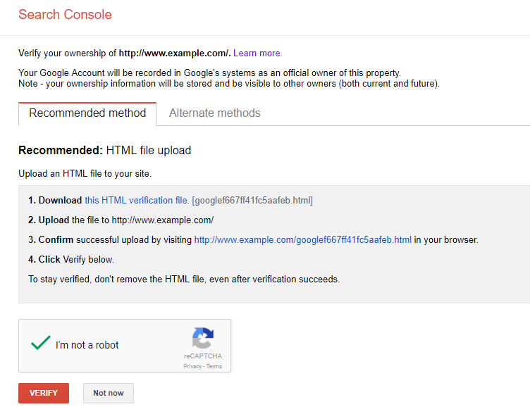
Printscreen from the verification area for the property added in Search Console
5. Verify the Crawl Rate
Another best practice recommended by Google developers is to verify the crawl rate to ensure your servers have enough capacity for the mobile version. We’ve previously talked about the crawl budget.
To understand how crawl rate works, we could clarify the meaning of crawl budget, first. The crawl budget is the limit of resources allocated for crawling by a server. More precisely, the number of pages crawled by search engines in a specific period of time. The crawl rate is the number of requests per second Google makes to your site when it is crawling it.
Google has a limit for the crawl budget and crawl rate, so you don’t overwhelm your server’s bandwidth. Google has algorithms that calculate the optimal server rate by crawling as many pages a user can access at each visit. You have the option to optimize and limit the crawl rate directly from Search Console. Select your property, go to the settings icon ⚙️ » Site Settings » Crawl rate. If you got to this point, you need to select the second option Limit Google’s maximum crawl rate and not the recommended option: Let Google optimize for my site.
Conclusion
We’ve heard many times before that mobile-friendly sites will decide the fate of your content’s site. Google’s behavior is focusing on mobile, as we saw through the multiple decisions they made always trying to fulfill the user’s wishes and needs. The mobile-first index tries to do that, by granting a higher value on mobile to those sites that are optimized for mobile.
Aligning your website to Google’s documentation can give you a hard time but we tried to explain in a way doesn’t make you want to blow your brain out. Since there are three ways to create a mobile website, there are different options for each: the responsive site, dynamic service site and m-dot website. If you decide to have a responsive website, which is the easiest way, you’ll have to have flexible text, images (SVGs) that can be resizable without affecting the quality and preserve a natural look.
The last two have primary content and markup that is different across mobile and desktop. For a dynamic serving website, you’ll have to serve structured data and robots.txt file for the mobile version like the one for desktop. Make sure your website is added to Search console for both versions and verify the crawl rate.
After that, you’re good to go!
The post Mobile-First Index Rolled Out. 5 Steps to Upgrade Your Mobile SEO Efforts appeared first on SEO Blog | cognitiveSEO Blog on SEO Tactics & Strategies.
SEO Blog | cognitiveSEO Blog on SEO Tactics & Strategies

No comments:
Post a Comment