
You finally came through.
After reading a bunch of blogging guides telling you to start your own email list, you wondered what the fuss was all about.
Neil Patel told you that “the money is in the list”.
Derek Halpern told you that “if you’re not building an email list, you are an idiot!”
And who wants to be an idiot? Right…
So, you finally signed up for an email service.
You went ahead and bought all the premium email marketing plugins and services.
You wrote a gigantic and massively impressive guide on your blog and now you’re patiently waiting, rubbing your hands together while having a sneaky evil smirk, for the flood of email subscribers to arrive.
You wait and wait… and wait, but the graph on your email service analytics is still invisible.
After a long while, if you are absolutely lucky, you capture a measly 5 or so email subscribers. Then after a year of constant effort, you still have less than 200 subscribers.
You wonder why you failed.
You plastered your website with multiple opt in forms and yet, your email list is empty.
“Maybe email list building is not for me”, you say to yourself.
But in truth, you’re just making humiliating rookie email list building mistakes3 that are sabotaging your success.
Avoid them and your email list will start flourishing.
Mistake 1: Awful placement of opt-in forms
Most bloggers believe that building an email list is all about plastering an opt-in form on the sidebar and getting conversions of 0.5%.
The sidebar widget is one of the lowest converting opt-in forms you could ever use. Sidebars are basically blind spots for readers, as they are rampant and exist on every single blog.
I am not saying they are completely useless. They can provide you with some subscribers, and if you effectively target your readers, you can even start building a considerable list from your sidebar opt-in form.
But the problem lies in the effort required to make that happen.
If you just stick up a generic freebie on your sidebar without targeting what your readers want, you are just basically wasting your sidebar space, that you could effectively use to sell your services.
Sure, you can get some conversions, but unless your traffic is gigantic, they really won’t stand out.
As a result, you need some other reinforcements that can get the job done.
I generally recommend that you have at least three or more opt-in forms on your site.
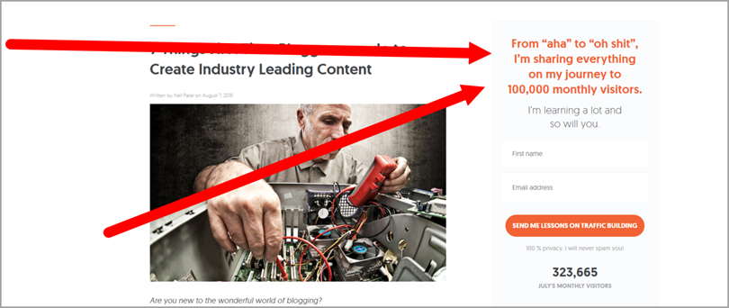
For example, if you check out Neil Patel’s blog, you can see that he uses 4 types of opt-in forms that get the job done if his sidebar opt-in form fails to do so.
- The feature box (an opt-in form that exists above your blog posts/pages.)

- The Full-Screen Pop-Up (Exit-Intent): A Pop-up that covers the whole screen when the reader is just about to leave.
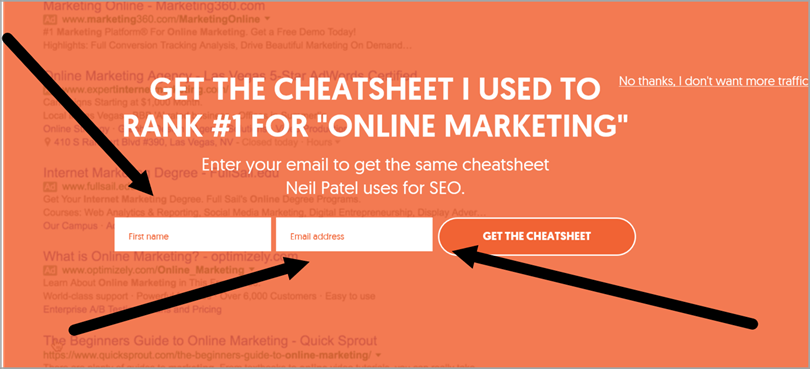
- The Regular Sidebar Opt-in Form (But his is not generic. Look at the headline of the offer. No one can resist that!!)
- The Almighty Content Upgrade (which builds upon the post and gives the reader a targeted freebie)
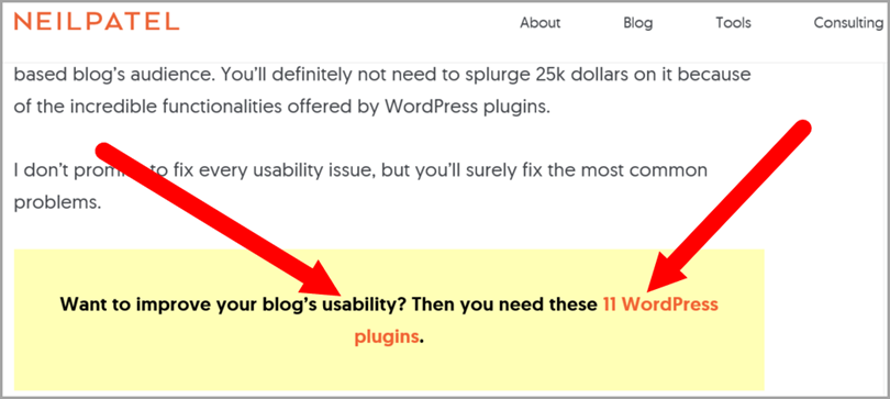
Having these other opt-in forms make sure that when your sidebar widget opt-in form ultimately fails at converting at a higher rate, the others will do the dirty job.
Mistake 2: Offering no bribes for your potential subscribers
The blogosphere has changed.
You can no longer collect your readers email addresses effectively without giving them something spicy in return.
In this age where there are millions of blogs, you have to stand out, in a major way.
Asking your visitors to give you their email addresses in return for monthly newsletter updates is no more acceptable.
E-mails have also gone more personal and people are becoming more and more protective of their inbox as a result of the growth of email marketing efforts by the other thousands of blogs.
You should think of the blogosphere as a system of corruption.
Woah!! Wait. I don’t mean you should be corrupt.
I meant that the whole system of email list building is about giving something in return for some favor. Readers give you their email in return for your bribe.
You give them more free content in return for their trust and finally, you give them premium content in return for their money.
If you are setting your whole list building success on the phrase “Join my newsletter”, let me crush your hopes right now and tell you that your blog will grow mightily slow.
And it’s not like building a freebie is a major task.
It doesn’t have to be the next critically acclaimed wonder beast of an eBook or video course.
Just create a simple short eBook that is targeted towards your readers and your niche and you are all set.
Recommendation: Instead of offering one e-book or one single bribe, you can offer your visitors a collection of freebies and bribes.
For example, Melyssa Griffin offers her “free library of e-books, worksheets and resources for online entrepreneurs + bloggers”

By offering several bribes, you will stand out from the pack and you will, ultimately, convert your visitors to subscribers at a higher rate.
All the bribes don’t necessarily have to be free e-books. You can easily create a collection of bribes by offering:
- A Short E-Book (Here is a simple step by step guide by Ramsey)
- A List of Your Recommended Tools
- A Checklist
- Your Top Recommended Blogs
- Your Top Recommended Blog Posts About a Topic
- Your Top 10-20 Books for “Your Niche”
By offering a collection of these bribes in one, you will skyrocket your email conversions. You don’t have to create each one of those. 2-3 is fine enough.
Mistake 3: Asking for too much personal information
There is really no need for you to ask for your visitors first name, last name, address…
All you really need to ask for in return for your bribe is their email address.
Even adding a bar which asks for their first name will significantly reduce your email list building effort.
It has been proven by this research done by Getresponse.
The only place where asking for more personal information is acceptable is if you are offering a business service that requires the reader to fill out a bunch of their personal information or…
You are already an established blogger and don’t need to grow your email list fast.
Other than that, you are basically reducing your opt-in rate significantly.
Mistake 4: Using the default opt-in form call-to-action1
Like I mentioned on Mistake 1, there is a phenomenon called reader blindness.
It basically occurs when something is Omni-present or exists everywhere.
Just like the sidebar exists on nearly every single blog that has an email marketing effort, the default call to actions on your opt-in form service are also everywhere.
Never, and I mean Never, use the default call-to-actions.
Here is a basic list of these CTA’s
- Submit
- Subscribe
- Join The Newsletter
- Join
- Sign Up
- Buy Now
- Click Here…
There are two significant problems that arise when you use these CTA’s
- You Will Cause Reader Blindness: These call to actions are so rampant on the blogging sphere that your blog and most importantly, your freebie, will seem like every other blog’s same generic offer.
- They Are Vague: Your Call to Actions should blatantly explain to the reader what he is getting in return for his email sacrifice.
For example, when you use “Subscribe”, the reader will be confronted with some basic but important questions;
What exactly am I subscribing to? Will this solve my problem? Am I really getting what I am signing up for?
Your CTA has to address these questions emphatically. When you use “Subscribe”, it really does not communicate to your reader what exactly he or she is getting.
Instead you should use more unique and to-the-point CTA’s.
For example, if I am offering a freebie on how to start a blog, your Call-to-Action shouldn’t be one of the default such as “subscribe”.
Instead it should resonate with something like this:
- Start Your Own Blog Easily
- Download The Step by Step Guide…
You see, when the reader subscribes using one of these CTA’s, he/she is sure that their problem is being addressed and most importantly solved.
Mistake 5: Discarding pop-ups because of their intrusiveness
Yes, they are intrusive. Yes, they might get on your reader’s nerves.
But what is ultimately proven is that they will convert interested and targeted readers into subscribers. There is even a case study on the Aweber blog, where a particular blogger got 1375% more subscribers from her light-box pop up than her sidebar.
By using Pop-ups, you can aggressively get an opt-in form right in front of your readers faces.
It is not a question about being polite here. You are here to do one job and one job only.
Get people subscribed and nothing does it more effectively than correctly optimized and targeted pop-ups.
If you are really into politeness, then you can use an exit-intent pop-up that only shows up when your visitors are just about to leave.
Mistake 6: Having no landing pages on your blog
No matter what niche you are in, if your ultimate goal is to increase your subscriber count and grow your email list, you definitely need a landing page for your freebies and your premium services, if you offer them.
A landing page completely removes all obstacles and unnecessary distractions from the eyes of your readers, and they will be faced with one important choice.
To join your email list/buy a product, or to get the hell out!
Easy choice! High Conversion!!

For example, above is Jeff’s landing page for his awesome 101+ Tips to Grow Traffic. If you look closely, there are no distractions (no home page, blog, contact, about us… buttons).
Just a small enticing description with a magnetic yellow opt-in button
Having no landing pages while you are trying to grow your email list is like trying to grow a baby without milk. It can grow, but it will be stunted.
Mistake 7: Having an ugly and scary website
This is an obvious one, but many bloggers still make the mistake of housing a horribly designed blog. When it comes to having an ugly website, there are usually two categories:
- You are still utilizing free themes: If your blog is created in the hope of building an email list and making an income from that list, you absolutely can’t be using a free theme.
Yes, Seth Godin made it without a premium theme, but you aren’t Seth Godin.
He and others who succeeded, without using a properly designed themes, are miracles. And when it comes to miracles, you shouldn’t set your whole success based on them.
- Your whole blog is plastered with Ads: Most probably, you figured out that you could make money from your blog and most of the guides told you that advertising was the ultimate way. So you created a blog and now it is literally a museum of ads.
If you didn’t figure it out already, using ads is the least effective way of making money, especially if you still don’t have a lot of traffic coming to your site.
The whole point of ads is to drag and steal your readers to another website. I really don’t understand why anybody without a major traffic source would ever consider ads as a monetization strategy.
You are basically selling your precious readers to other sites for 10 cents.
Anyways, always make sure that you are using a premium theme and have no sneaky ads on your blog.
Mistake 8: Having no personalized landing pages for guest posts
If you know anything about growing your blog and your email list, you probably know that guest postingis a major part of the strategy.
With guest posting, you can appear in front of your target audience without having to pay for anything. You basically write an amazing guide related to your niche and you pitch other bloggers in your niche to post that guide on their website.
You can get massive results from proper guest posting.
Sarah from Unsettle got over 500 subscribers from her first guest post on Fast Company.

Bryan Harris from Videofruit also got over 500 subscribers from his guest post on LeadPages.
But, many bloggers fail to replicate this massive success at guest posting and the major reason for that is;
They don’t have a specific landing page for each of their guest posts.
If you are writing guest posts without having a landing page with a freebie related to the post, you are outright wasting your time.
You need to create a landing page for each of your guest posts and make sure you give them a content upgrade. What is that?
Well…
Mistake 9: Offering no content upgrades
If you want your guest posting email list building campaign to be a major success, you absolutely need to offer content upgrades for the readers at your guest blog.
You see, it is not enough to just direct readers from the blog towards your homepage or in fact, your original landing page.
You want the readers of that guest blog to be directed to a landing page that builds upon what they have read. By offering a freebie that is related to the post you wrote, you will significantly increase your subscription rate.
Here is Sarah’s landing page for her Fast Company guest post that contains the content upgrade. She addressed the readers pleasantly by “Welcoming” them which makes them feel exclusive.

And the best part is that this content upgrade doesn’t even have to be something brilliant.
It can basically be:
- A PDF of the guest post you wrote (use this if the post is massive)
- A Checklist (If you wrote a step by step guide)
- A Cheatsheet
- A Tiny E-Book
- A Tool Book
To ensure the effectiveness of your guest post, your author bio only has to have a link to that specific landing page. If your author bio has links to social media or worse, your homepage, your landing page link will have to fight for attention.
Bonus tip: Amaze your readers by giving them your content upgrade and a small collection of freebies as a bonus.
Mistake 10: Not having a page that shows your subscribers “How to Confirm Their Subscription”
So you finally convince your visitor to subscribe to your email list in return for the freebie, but your fight is not yet over.
Most probably, you are using a double opt-in feature on your email marketing service that requires people to confirm their subscription.
If you don’t notify your potential subscribers that they have to confirm their subscription before they officially become a subscriber, you will lose a significant portion of your readers who gave you their emails.
As a result, you want to have a page (which comes up when someone joins your email list) that tells them emphatically to confirm their subscription before they can receive your freebie.
Here are some examples to imitate:
Here is a simple page from Brian Dean, that is effective.
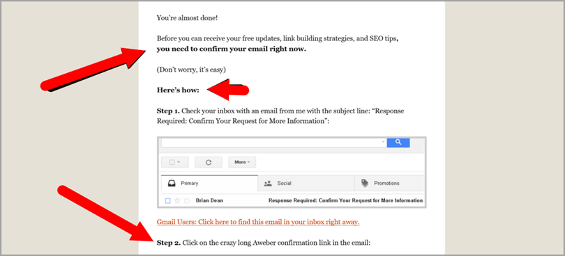
Just tell your subscribers that they are not done yet and show them a simple step by step tutorial on how to officially confirm their subscription.
Mistake 11: Having no call-to-actions on your freebie download page
Yes!!
You made it. You are finally getting your readers and blog visitors to join your email list, but unbeknownst to you, you are actually still sabotaging your email list building campaign.
When people subscribe to your blog, it is because they admired your content or want to receive your freebies.
Now, when bloggers get subscribers, they make the mistake of being too polite to your new subscribers. They basically gave you their email address, you should be more courteous right?
Wrong.
You already convinced them to click on your call to action, what is keeping them from following your next call to action?
If you haven’t figured it out yet, let me bluntly tell you.
It’s you.
You might be saying “How?”
Well, if you are like most bloggers, your freebie download page (which is only visible when someone subscribes), has nothing except the links to the freebies.
What is wrong with that?
When people follow your CTA, they are mostly likely to follow your next CTA.
So if someone subscribes to your email list, he/she will be likely to follow your next call-to-action.
What should your next call to action be?
- You can ask them to share your opt-in page (NOT your download page) so you can capture more email addresses.
- You can ask them to send you an email with specific questions (More ideas for you) …
By taking advantage of your new subscribes momentum to follow call-to-actions, you can increase your email list.
Here is an example from Unsettle:
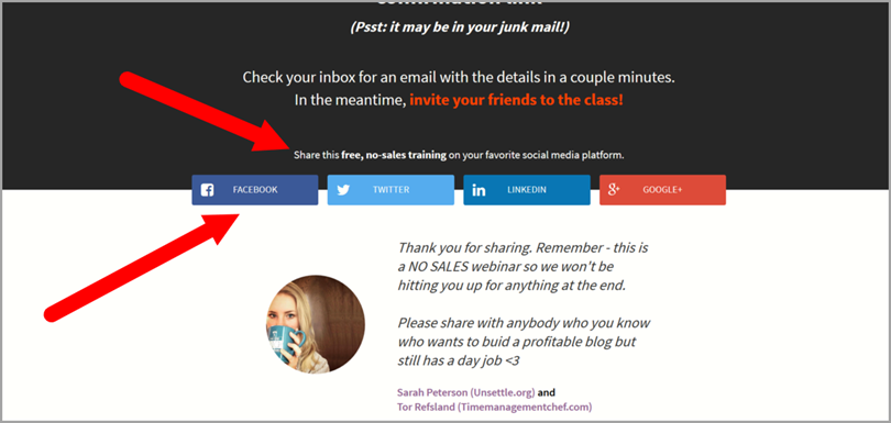
You see how she calls on new subscribers to share the post. By doing this, you will definitely increase your subscriber count.
Mistake 12: Having no system of converting people who comment
Why do people comment?
There are many reasons but all of them can be classified into one of the following categories:
- They Like Your Content and Want to Appreciate Your Work
- They Have a Question Regarding the Topic
- They Are There to Troll, Spam or Hate
Most of the people who will comment on your site will be either in category 1 or 2 or a combination of both.
They like your work. They have a question for you.
Now, if you put up a system where those types of people who comment are redirected to a landing page to subscribe, do you think you will increase your email list?
Hell yeah!
There are several WordPress plugins you can use to put up that system on your blog. You don’t need any coding skills.
Here is one you can use. There are multiple options.
Mistake 13: An about us page with no opt-in forms
If you look closely at your Google Analytics dashboard, you will most probably see that your About us page will be one of the most visited pages on your site.
As a result, it has a higher chance of getting more email subscribers.
Yet, many bloggers’ About Us Page is nothing but a long story of their personal hardship and how they came about growing this blog.
Yes, long stories are inspiring and will help your reader understand you more, but you need multiple opt-in forms on your About Us page.
If properly optimized, your About Us Page can do wonders to your email list.
And do you know why?
Most people who click on the “About” page are already interested in you and want to learn more about you. They are not just random traffic.
Here is a portion of Derek’s About Page. As you can see, he blends in opt-in forms on his about page, because he knows that people who click on his About page are interested in his content or services.
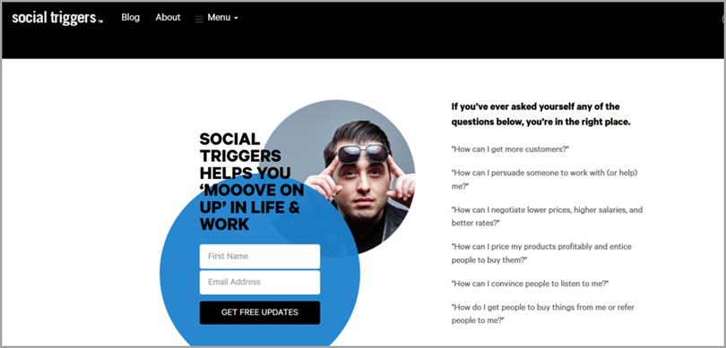
By embedding some opt-in forms in your long and inspiring story, you can gain a respectable number of subscribers from your About Us Page.
Mistake 14: Using default email templates
Never… ever… use the default email templates that are written by computers.
You should personalize each of the emails that your potential subscriber will get:
- The “Confirm Your Subscription” Email
- The “Welcome” Email
- Future Emails You Will Send
Never use emails that were written by emotionless computers. Humans are creatures of emotion. You have to evoke feelings in them to capture their interest.
You can’t just be using regurgitated lackluster emails.
Using these default email templates will increase your unsubscribe rate. You will lose the potential subscribers that you worked hard for.
Write personalized and well thought out emails. If you are funny, be humorous on your emails. If you have a story that relates to your reader’s fears, tell them the story (don’t make it a novel)
It will cause your readers to view you as a real person who they can relate to rather than just some robotic freak on the other side of their screen.
You can even take this even further by…
Mistake 15: Forgetting to ask your new subscribers to reply back with their specific problems
There are two massive reasons for why you should blatantly ask your new subscribers to reply to your “welcome email” with a specific question they have.
- It Builds Trust with your subscribers. If you potentially solve their problem or answer their question, they will start seeing you as a mentor and will recommend and forward your offers to their friends and acquaintances. This effect will then ultimately help you grow your blog and your email list.
If you can start building these types of relationships with your new subscribers, they will also be 100X more likely to buy and support your future premium offers and services.
- It helps you come up with ideas for a blog post, guest post or even better, a future product. You no longer have to guess blindly what your readers want. You can basically identify what they want by connecting with them on a personal level.
Mistake 16: Buying a list
This shouldn’t even be an option in the first place, but I am still amazed by how some people believe that they can succeed by taking a shortcut.
Don’t even consider buying an email list.
There are several reasons why buying an email list is a waste of your money and time, but the major ones are:
- Major Email Marketing Services won’t allow you to send emails to lists that you bought. Email providers such as Aweber explicitly state that they will not accept email lists that are bought. You may be fined if you don’t follow their regulations.
- Your Email List Will Be Dirty: Yes, they claim that you will get clean email lists, but that is far from the fact. You will get spammers, that is an obvious fact. The quality of the email’s will also be low and most of them won’t even be active email’s.
Rather than causing yourself a headache and beating yourself up later on, you are just better off by building an email list the right way (which is obviously the slow way).
There really is no shortcut to building an email list.
Over to you
Stop sabotaging your email list building efforts by committing those 16 email list building crimes.
Avoid them and you shall prosper.
There really is no reason for why some bloggers still make these mistakes.
If you want to succeed at growing your email list, you have to completely eliminate and obliterate these mistakes from your list building strategy.
Some of these mistakes might be knew to you and will require you to make some radical, yet important, changes to your blog.
But identifying what is wrong is only half the battle.
When it comes to growing your email list, you have to not only avoid the wrong steps but you also have to start taking the right steps.
Guest Author: Yohan Michael is the author of Dynamiteblogging, where he helps bloggers grow their blog into a booming and prosperous business. Get his report, 5 Almighty Methods for Growing Your Email List + 4 Bonus E-Books, to finally start making some email gains.

No comments:
Post a Comment